The 5 Most Abused Rules of Composition
Rules of Composition
Single Point
I often argue that this is likely the most abused rule of them all,
because people don’t really seem to understand that it exists.
The general rule is as follows:
The farther you place a single point of interest from the centre of the frame, the more interesting it becomes, but the more justification you need for it to be there.
When you place a single point in the centre of the frame, such as a
person’s face, it needs no justification for being there, but it’s by no
means interesting.
Conversely, when you place a single point way off into the corner, then it will portray a very different feeling.
Have a look at the photo below.
I wanted to display a feeling of loneliness and a great expanse by
placing the boat in the corner. This would not have been achieved if the
boat was in the centre of the frame.

Always consider what you’re trying to portray with your photos, as this will dictate your placement.
Rule of Thirds
This is likely the first rule that you ever learned, as it’s probably
the most popular rule. The trouble is, some people treat it as gospel,
when in reality, it’s just a good guide.
The rule is as follows:
Divide your frame up into thirds – two equally spaced horizontal and vertical lines. Then align important features in the frame with these lines, and the intersect points.
While it’s a very good rule, and it will help to make your photo more
interesting, and add depth, it’s not a rule which should be followed
blindly. Just because the rule says so, doesn’t mean that you should.
The truth of the matter is that it all comes down to placement, like it
does with a single point. Too close to the centre and it’s boring, too
close to the edge and it’s too drastic.
The rule of thirds is there to guide you to a safe area of the frame,
where you’re not stepping on any toes, or making dramatic moves with
your composition.
While it’s a great rule, and one that you should all know about, you
need to consider what you’re trying to convey with your photo.
It can start to look very structured if you follow the rule blindly, and that appears to be quite obvious.

Horizon Placement
All too often people think it’s a good idea to place their horizon in
the middle of the frame, when in reality, this is just diving the photo
in half, and making it look dull.
Here’s the general rule:
If you were to decide that the top half of the frame is much more interesting than the bottom, then you may want to adjust your composition so that the horizon is low in the frame. And vice versa. Find the interesting part of the frame, and adjust the horizon placement to emphasise this.
It’s a great rule, and one you should absolutely follow, although most people don’t.
Think about it. How interesting is a plain blue sky in your photo, compared to what’s happening on the ground? Not very.

Triangles
Triangle have a strong hold on your photos, although it seems that most people don’t quite understand exactly what they do.
It all comes down to the apex (Latin for summit, peak, tip, top, extreme end) of the triangle, and where that’s positioned.
The general rule is as follows:
Lines, paths, and points of interest in a photo, are combined to create a triangle. The positioning and direction of this triangle can change the perceived stability of a photo.
Because a triangle has so much control over the stability, you need
to be more careful about using the incorrectly, than not using them at
all.
For a photo of a building, you would likely have a flat ground at the
bottom, with an apex at the top, which appears to be very stable, but if
you rotate the angle of your camera, this will start to appear less and
less stable.
If you want to make your photo appear unstable, then this is a really powerful rule to be able to control.

Balance
There is some form of balance in every photo we look at, and it’s up
to us to determine whether we want a balanced, or unbalanced, photo.
Here is the general rule:
Balance is at the base of every composition; it determines whether the photo is pleasing and harmonious to look at, or rather uncomfortable and unresolved. It all comes down to visual weight and placement, which decides whether the left side is heavier than the right, or vice versa.
I won’t go into too much detail about balance, because you can read all about it here, but the general gist is that we look at a photo like a weighing scale.
If there’s too much going on, on the left, then the photo is unbalanced
to the left. Whether we want the photo be balanced or not us up to us,
but it pays to know why you may or may not want it to be.
A balanced photo is pleasing and harmonious, and unbalanced photo is
uncomfortable and unresolved. Which do you want your photo to be, and
more importantly, why?
The more aware you are of the effects of balance on your photos, the
better your photography will be, so it pays to think about how you want
to portray your image before you pick up your camera.
Degrees of balance is at the heart of every photo and can’t be ignored
so use it wisely, and remember, that any technique, if used to excess,
is going to lose its worth.

-------------------------------------------------------------------------------------
Some photos just pop off the screen and grab your attention. There is one primary reason why.
The Subject is Clear and Concise!
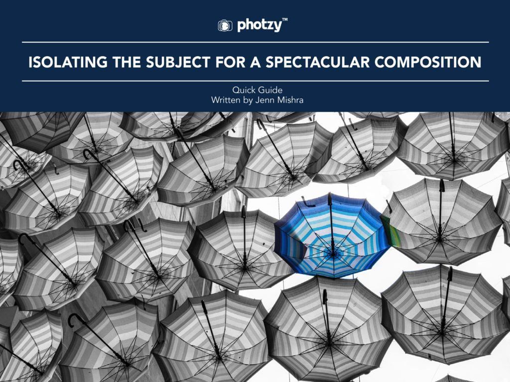
Isolating the subject is a critical compositional tool in photography.
It simplifies and increases the impact of your image. It also clearly communicates to your viewer what the photograph is meant to convey.
Isolating the subject seems like it should be easy. You look at something. Click, the camera shutter releases.
How hard can it be?
If you’ve been taking pictures for any length of time, you realize that it isn’t easy. Quite the opposite, actually.
Many photographers struggle with having an exact center of interest in their photos.
There are a couple of reasons for this.
- The photographer has an unclear vision of what the subject truly is.
- Our brain fills in the gaps outside of the camera frame while looking at the scene, something the viewer of a photograph cannot do.
- The area surrounding the subject is busy and complicated.
- The photographer hasn’t a clear understanding of making the subject stand out from the surrounding areas.
In this eBook, Photzy Author Jenn Mishra will share with you some tried and true techniques for isolating and emphasizing a subject within a photo.
Here are some of the topics covered:
- Simplifying Backgrounds
- Using Shallow Depth-of-Field
- Cropping and Filling the Frame
- Cloning and Other Post-Production Techniques to Eliminate or De-emphasize Distractions
- Using Contrasting Elements to Emphasize a Portion of the Image Frame
You’ll find all the answers right here!
No comments:
Post a Comment
Note: Only a member of this blog may post a comment.