Monday, May 9, 2022

#Double Exposures, Film Photography

How to Create a Double Exposure in Photoshop (Easily!)

width=

Double exposures are a great way to get creative with images in a simple way. It’s a technique that uses two photographs to create a new image. It can be a powerful way to present a concept or a fun way to combine two scenes.

Today, I will show you how to create your double exposure in Photoshop. I have been working with double exposures in film photography and digital photography for a few years. Here are the best tips I have picked up from these years of practice.
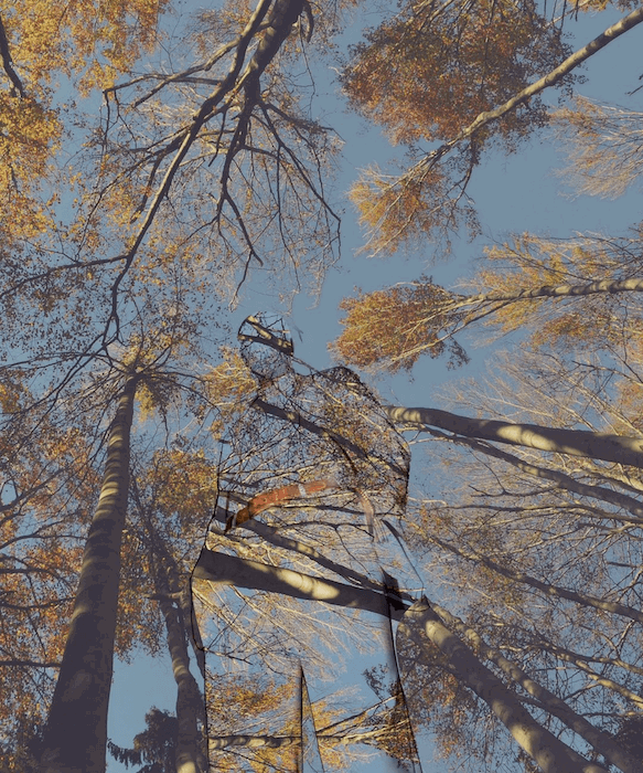
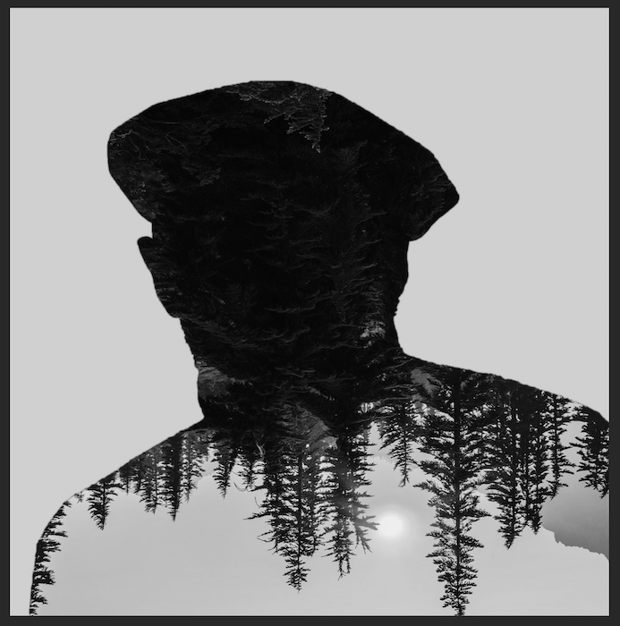
Double exposure made on Photoshop of a figure standing amongst trees.
Anna Maghradze

What Is A Double Exposure?

A double exposure in photography is when you take two exposures over the same section of film or digital sensor. This means that the film or image you get on your digital camera will have an overlay of two images on a single image.

A majority of digital cameras will not give you the option to make a double exposure, so you will have to do this on Adobe Photoshop. With film cameras, you have to rewind the film and then reshoot the whole film again! This means you will get a random double exposure (unless you counted your frames and remember your images well!).

Double exposure work by taking advantage of the dark sections in an image. If a specific section hasn’t been exposed, the second exposure is likely to fill in these areas. This means dark places will disappear in a double exposure, and light spots will punch through.
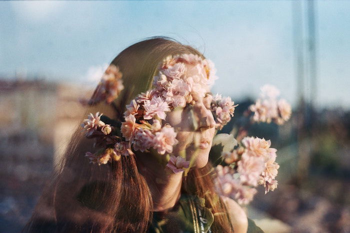
Double exposure maybe taken on film with a girls face being hidden amongst flowers

What is a Double Exposure Effect?

A double exposure effect is a technique you can do on Adobe Photoshop to achieve a double exposure but with added control. With a photographic method based on chance, control means the edit’s success will rely on your creativity alone.

The control you have ranges from the images you choose to which part of the picture contains each image. Often, this comes in the form where a landscape is projected onto someone’s clothes or faces.

You can add gradients and even use two or more exposures for extra control. It all depends on what image you are trying to create and what feeling you want to convey to the viewer.
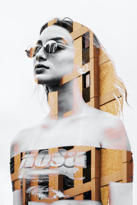
Double exposure of a girl and a tall building. Model is wearing glasses and is a black and white image whereas the building is in colour.

Why Create a Double Exposure?

Double exposure photos create a great relationship between two images. They are great for making images that look like you are looking into the subject’s soul. A great example is when you use landscapes as the second image inside a model. We are presented with a scene and cannot help but link our feelings to the person depicted.

We can use this to our advantage. If we want to portray someone as calm, we could pick the sea as the second exposure. Similarly, if we wanted to depict someone as angry, we could pick fire as the second exposure.

Alternately, we could use an empty subject and fill it with people. This could work well for a picture of your family home. You can put a portrait of your family members inside this house!
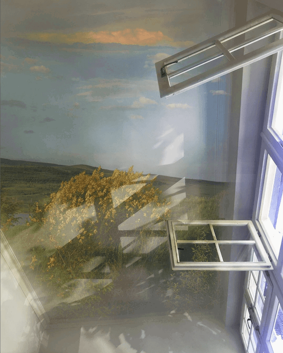
Double exposure where the camera is looking at the ceiling of the room. On this ceiling is a picture of a landscape in the summer or spring time.
Anna Maghradze

How to Make a Double Exposure Effect in Photoshop

A double exposure effect can be tricky to get your head around. Trial and error will be a part of this process, but to help, I will guide you through an easy step-by-step.

Step 1: Selecting and Masking your Image

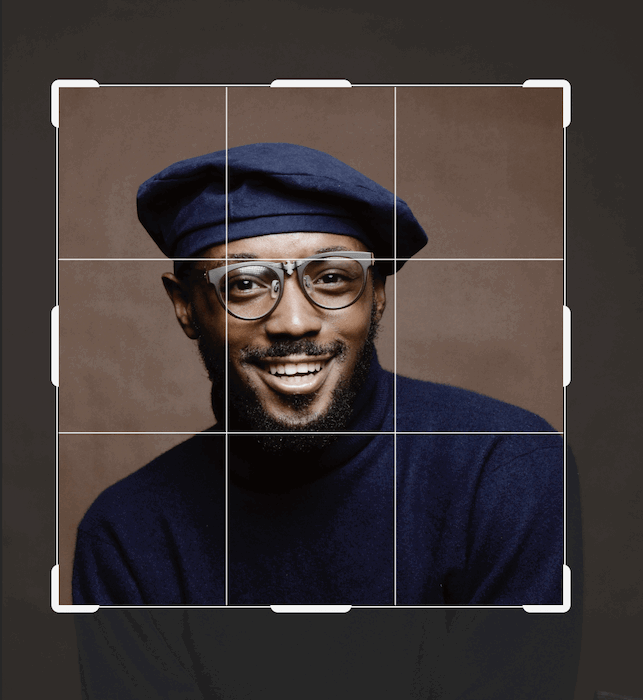
First, find the image you want to be the main subject of your photograph. This could be anything from your pet to a lamp! I have chosen this portrait from a stock image site, unsplash.com. Now, open your image in Adobe Photoshop.
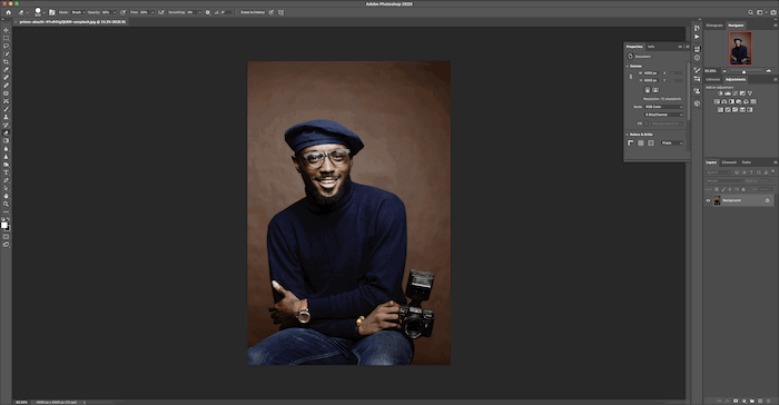
screenshot of the portrait I'm using to create a double exposure in photoshop

Crop the image to your ideal size.

Using crosshairs in photoshop to center the portrait

This is the suitable composition that I want for my final image.

the portrait I'm using to create a double exposure in photoshop

I will duplicate my background by dragging the layer to the bottom and dropping it on the “new layer” thumbnail.
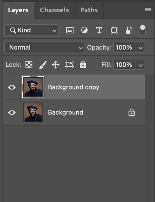
selecting the background copy layer in photoshop

Next, grab your Quick Select tool from the left-hand toolbar. Be sure the top brush has a + sign next to it.
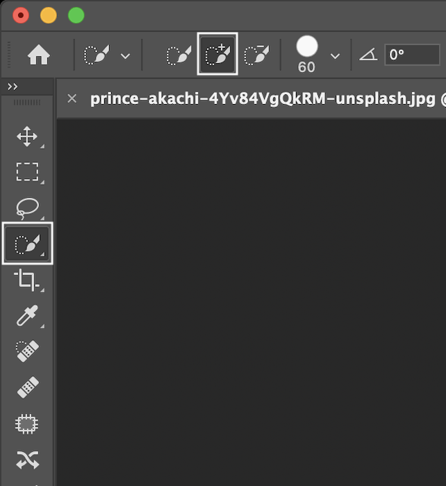
selecting the correct brush in photoshop

Now you can start slowly painting the subject you want to select.
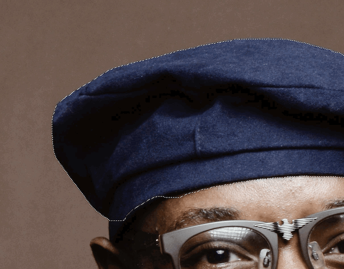
marching ants showing the selection in photoshop

Once the whole body is selected, make sure you double-check the image to avoid missing any parts. Select “add layer mask” at the bottom of your layers toolbar.

selecting add layer mask in photoshop

This new box will now appear towards the right of your screen. Click on “select and mask”.
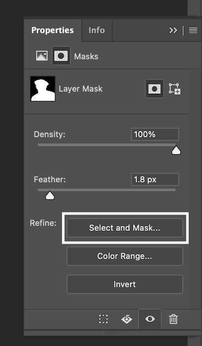
select and mask pop up

This will bring up this new page. Here you can feather the outline to about 2 pixels. Most importantly, under Output Settings, make sure you output to a Layer Mask.
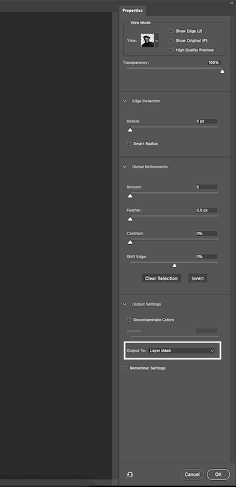
screenshot of output to layer mask in photoshop

Step 2: Prepping The Image

We will add a solid colour layer to have a neutral background. Go to New Adjustment Layers at the bottom of the layers toolbar and select “solid colour”.
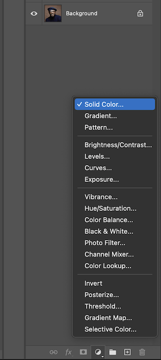
selecting solid color in photoshop

Here you can choose any colour you like, but I will go with a neutral grey.
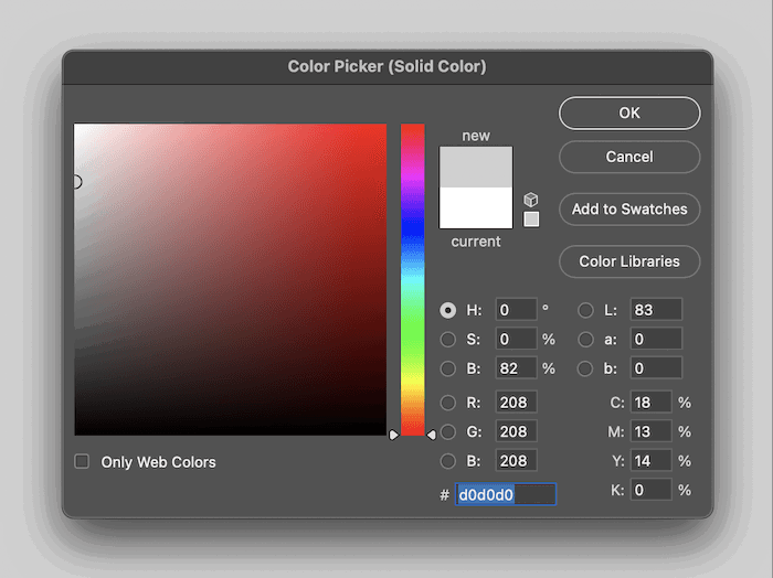
selecting a solid color in the color picker pop up box

This is what your layers section will look like.
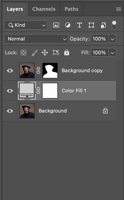
screenshot of the layers panel in photoshop

And this is how your image should currently look.

the portrait I'm using for my double exposure in photoshop

Step 3: Adding Your Double Exposure

Now, let’s bring up the second image that you want inside your subject. I have chosen this forest scene.
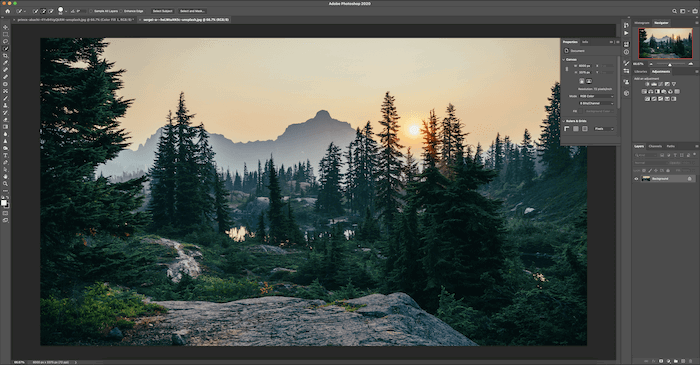
the image I'm imprinting on the portrait to create a double exposure in photoshop

I want to stick with being monochromatic, so I go to Image > Adjustments > Desaturate.
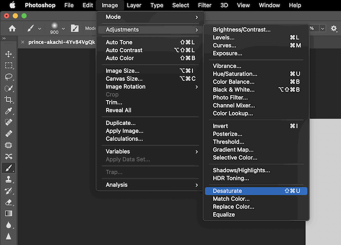
screenshot of the desaturate option in photoshop

Let’s move this image into the other photoshop document by dragging the layer across.
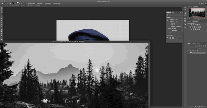
dragging the image onto the portrait

Use Command+T (Control+T for Windows) to adjust the image how you would like it. I have rotated the image to make the image a bit more interesting.
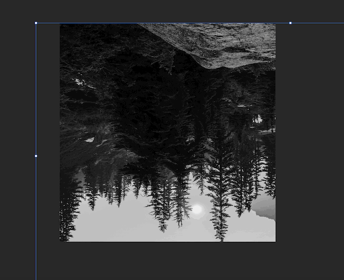
the rotated version of the image I'm using to imprint on the portrait to create a double exposure

I am happy with this selection because the dark bit of the image is roughly where the model’s face will be.
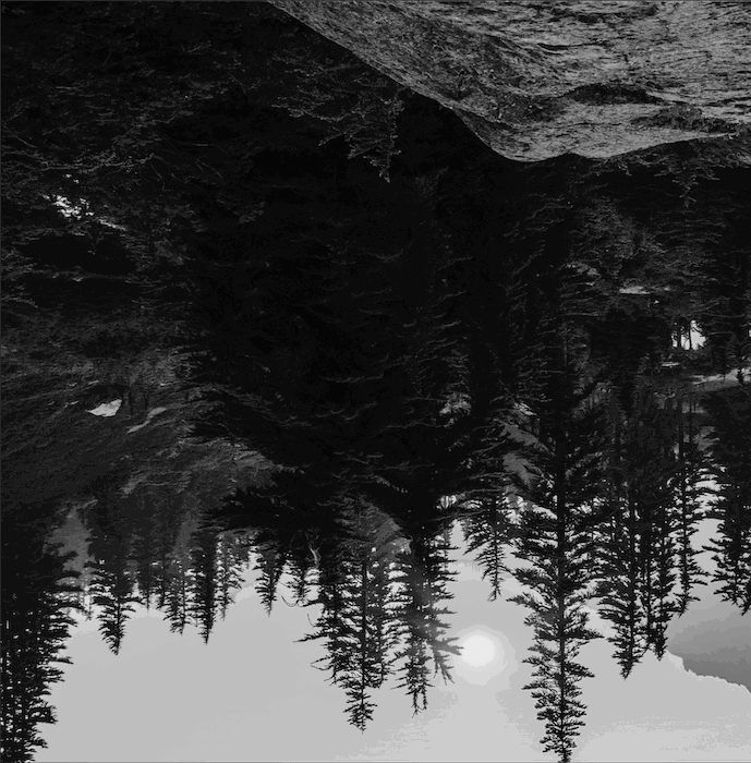
the rotated version of the image I'm using to imprint on the portrait to create a double exposure

Command+click (Control+click for windows) the layer mask of the model.
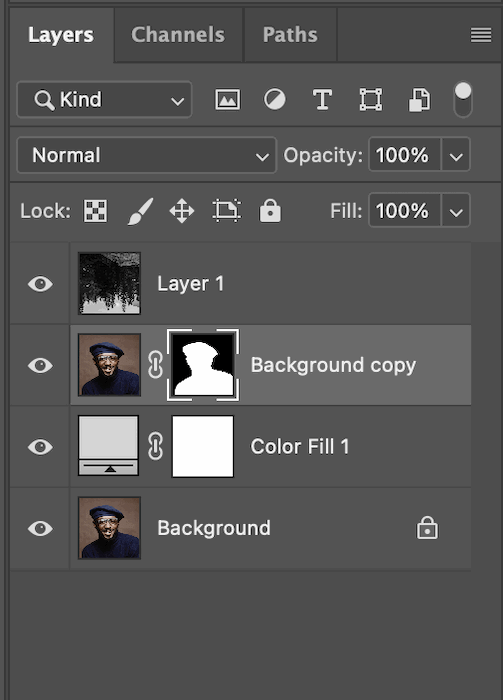
screenshot of selecting the background copy in the layers panel

This will add the silhouette to your image. This is an excellent way to see how the image will look on your subject.
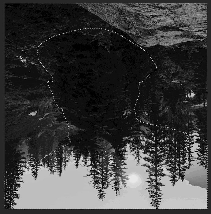
marching ants showing the selection of the portrait to create a double exposure

With the marching ants still over your image, select the new layer (the forest image) and click on “add a mask”.

screenshot of add a mask icon in photoshop

This is how your image should look.

the beginning stage of a double exposure in photoshop

Select your original layer and duplicate it by dragging it to the bottom of the Layers toolbar and dropping it on Add New Layer. Then bring the new layer to the top.
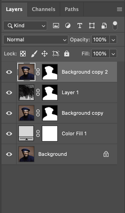
screenshot of selecting the background copy in the layers tab

We will add contrast to this new layer to improve the double exposure effect. Go to Image > Adjustments > Levels.
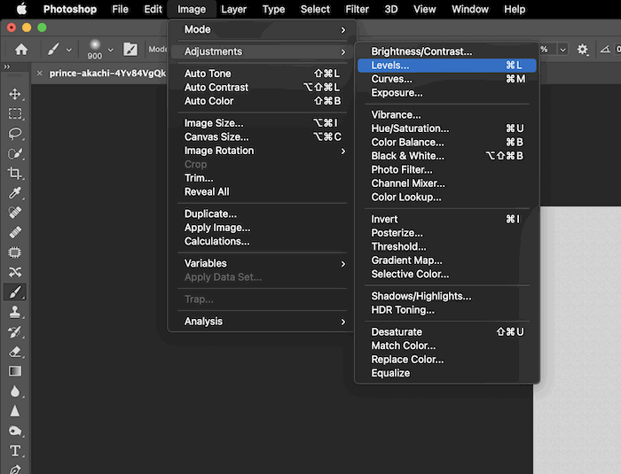
screenshot of selecting levels in the drop down menu in photoshop

Use the Shadow and Highlight sliders to add more contrast to your liking. My image already has a bit of contrast, so I won’t mess with this too much.
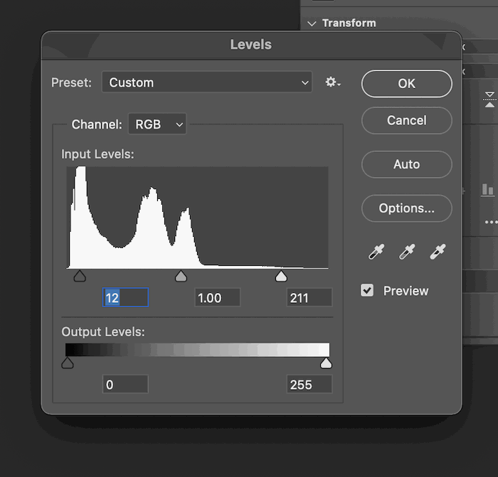
screenshot of contrast values in the levels pop up screen in photoshop

Now desaturate this layer as well.

screenshot of the desaturate option in photoshop

Finally, let’s go to the blending modes for our new top layer. You can select these to see which works best, but I have found that Screen replicates a double exposure best.
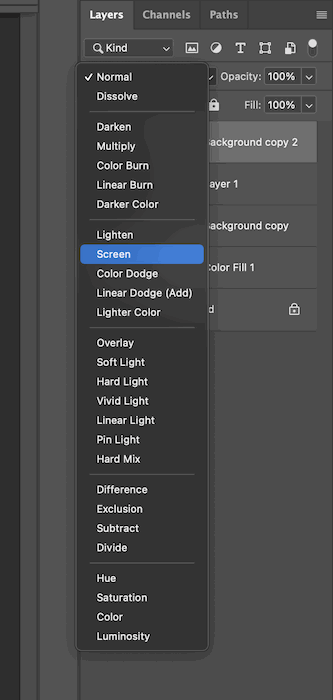
selecting the screen option in the layers tab in photoshop

This is what your image should now look like.
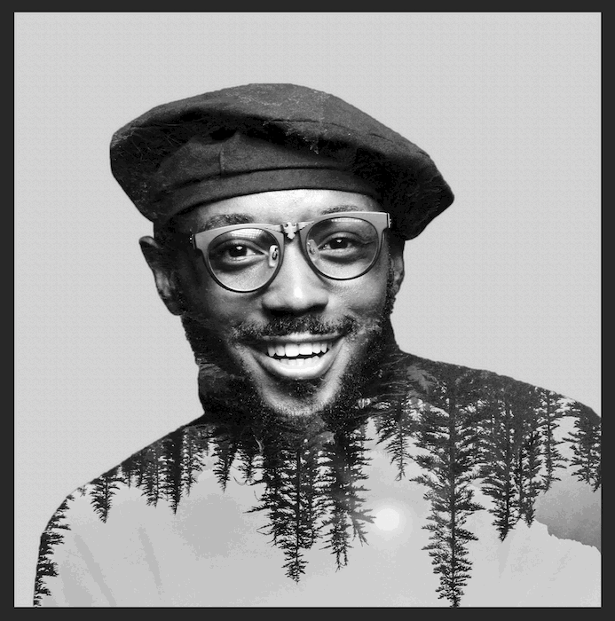
how your image should look with the double exposure effect

Step 4: Extra Touches

To give the image a bit more depth, let’s add a slight shadow behind our subject. First, select the “colour fill” layer.
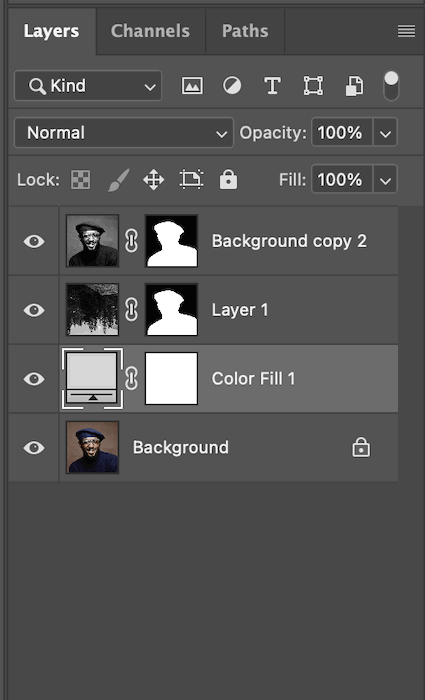
selecting color fill in the layers tab

Now, grab the brush tool and set a low Opacity and Flow. Make sure your brush has soft edges, and you’re painting with black selected.

screenshot of the opacity and flow values in photoshop

Slowly go around your image outline and add where you think the shade is necessary. This is what my image will look like.
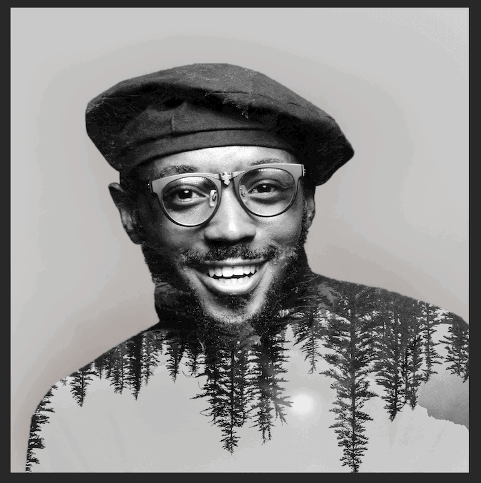
how your double exposure image should look at this stage

If I were to Alt-click on the Colour Fill mask, this slight shadow is what you will see. It doesn’t seem like much, but it helps the subject pop out the image nicely.

the shadow of the portrait

Now you have a simple double exposure!
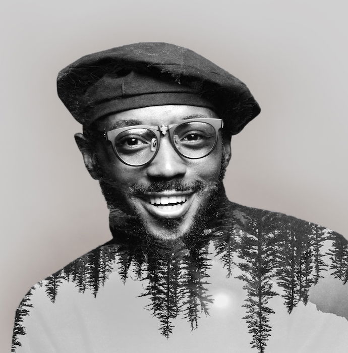
the final image with the double exposure effect

Double exposure photos have a unique aesthetic to them. Using this aesthetic to your advantage can produce some impactful images. This allows you to make a double exposure in Photoshop that isn’t just aesthetically pleasing but also conceptual. Maybe you choose a landscape that is important to the subject? Or perhaps you make an object the subject and put a group image of you and your friends inside?

---------------------------------------------------------------------------------- 

Another FREE Photography Ebook 
What Should Be On Your Photoshoot Prep Checklist – Free Quick Guide


Whether you are getting ready to photograph a wedding, a senior portrait, or a vacation spot, it pays to be prepared – literally.

Prepared photographers make more money and come away with better pictures.

Going into your shoot organized means that you can give your clients your full attention during the photoshoot, control what you can, and limit what can go wrong.

When the inevitable happens and something does not go as planned, you are ready with a solution.

You feel confident and so does your client. A happy client is a repeat client!

In this eBook, we will cover what should be on your photoshoot prep checklist.

Having a checklist ensures that you do not forget something important, and you can move seamlessly from one shooting opportunity to the next. Most importantly, you can go into the day focused on making beautiful images.

Here is what will be covered in detail:

  • Collecting Supplies, Equipment, and Gear
  • Preparing Equipment and Gear
  • Confirming Project Details and Expectations
  • Scouting Location
  • Planning a Backup

Your Copy is Here.

Photo Credit: H.F.E. & Co Studio

 
---------------------------------------------------------------------------------- 

Saturday, May 7, 2022

#Camera Modes, Camera Hacks
 
Free Photography Ebook

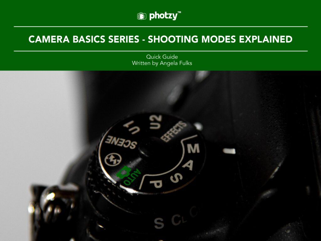
Camera Basics Series: Shooting Modes Explained – Free Quick Guide


There probably isn’t a more confusing and misunderstood topic on the camera side of photography than the shooting modes.

Shooting modes may be incredibly confusing to people just starting in photography; after all, there are so many letters and icons on that mode dial! What do these letters and icons mean?

Good question! And the sooner you understand them; the earlier your photography will improve and become more predictable.

This is what will be covered in this guide:

  • Auto Mode
  • Program Mode
  • Shutter Speed Priority Mode
  • Aperture Priority Mode
  • Manual Mode
  • The differences in the Nikon and Canon mode dials
  • A note on Scene Modes

There are those that believe that the manual mode is the only mode that a real photographer uses.

We don’t believe that. There are reasons that all of these different modes are available to photographers, even on the most professional level DSLR cameras.

Each mode has a purpose.

Are you ready to learn about them? Let’s go! 

--------------------------------------------------------------------------------------


Thursday, May 5, 2022

How to Choose Horizon Placement in Composition

Why Horizons

When a frame is divided by a single, dominant line, more often than not this is due to a Horizon. They’re fairly common in outdoor photography, particularly landscapes.
If the photo is of nothing particularly interesting, this line can become the dominant part of the photo for the way it separates the frame.

Where to Place the Horizon and Why?

Firstly, I think it’s important to realise where you don’t want to place the line, and that’s directly in the middle of the frame. That’s not to say that you shouldn’t ever it, this just has a tendency to divide the photo in half, creating an uneven photo.
The contrast between the two halves makes it look more like two separate photos.
Exactly where you place the horizon is completely up to you but it helps to remember that, if a feature of a photo does nothing to improve it, it has no place in the photo to begin with.
Here’s a photo where the horizon has divided the frame in two. Notice that it doesn’t really favor either half.A cityscape to show correct Horizon Placement
If you take the horizon and place it slightly lower in the frame, you regain a feeling of stability which balances out the photo better.
You also remove the feeling of division and the whole photo starts to come together as a single image made up of multiple elements, rather than just two photos stuck together.
Have a look at the photo below to see what I mean.
If you were to decide that the top half of the frame was much more interesting than the bottom, you may want to adjust your composition so that the horizon is a lot lower in the frame.
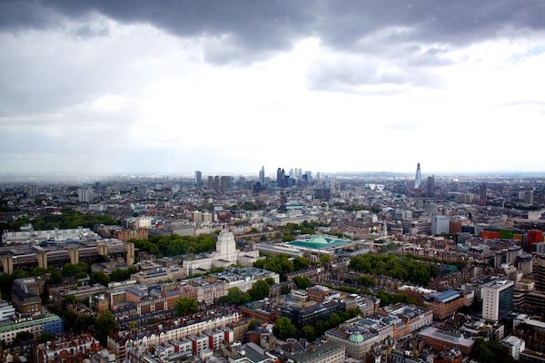
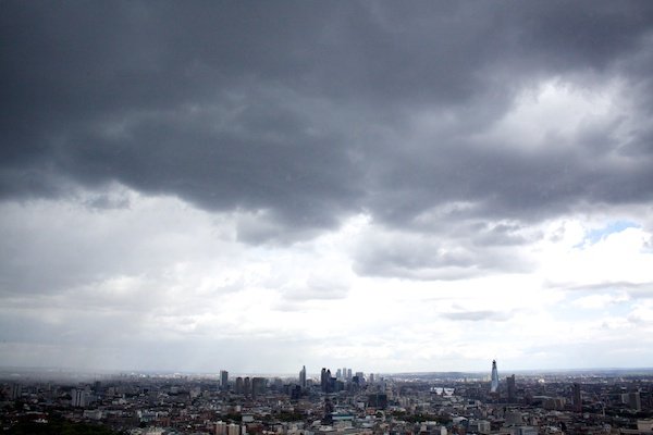
The photo below was taken from a tower in London on a rainy day with emphasis on the sky.
The cityscape adds an interesting texture to photo but holds much less visual weight. It serves to make the man made city look small in comparison to the powerful sky and weather.
This is one of the many interesting, extra feelings which can be evoked when you consider the importance of different aspects of a photo and adjust your composition accordingly.A cityscape to show an interesting Horizon Placement
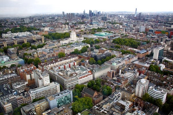
The photo below was taken directly after the photo above and focuses largely on the ground, rather than the sky.
This photo contrasts greatly with the one above because it doesn’t evoke the same feelings, instead focusing more on the colour and lines in the city.
Your eyes are naturally drawn up the photo from the colour of the trees and houses at the bottom of the frame to the sharp and jagged nature of the buildings by the sky at the top.
An equally interesting photo but for different reasons, all because of the decisions made over the placement of the horizon. Importantly though, you’ll see that both images are stronger than the original image which cut the photo in half.A cityscape to show an unusual Horizon Placement
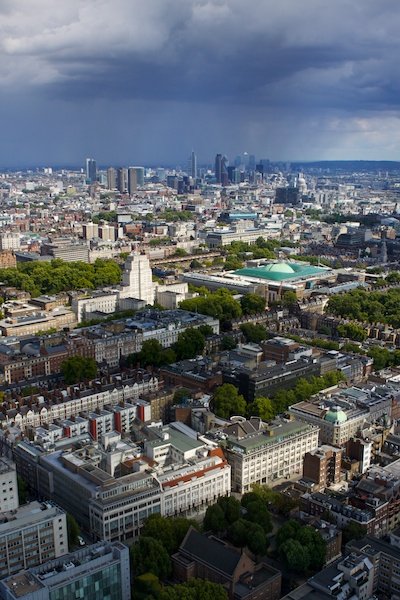
If you want to include both the sky and the ground but don’t want to cut the photo in half, I recommend changing the orientation to portrait.
Again, you’ll probably want to avoid placing the horizon in the middle of the frame but the decision is up to you.
I personally feel that the composition in the photo below is stronger than any of the photos above as it includes the most interesting parts of each photo.
The weather had changed slightly between photos, meaning that there was less uninteresting sky in the photo. This certainly helped towards finding the perfect balance between sky and ground.
It’s all about thinking it through and experimenting with what works for you.A cityscape to show correct Horizon Placement in portrait

High Horizon

Now that we’ve covered why you want to include a high or a low horizon, let’s have a look at some examples.
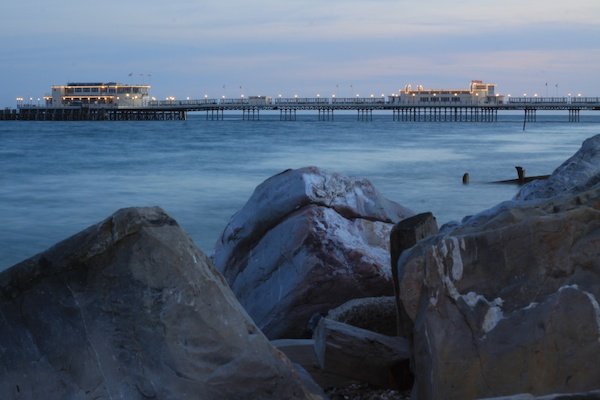
The high horizon in this photo was an obvious choice as the sky was particularly plain and uninteresting on the evening that I took this photo.
Realising this, I made a special effort to include the foreground a little bit more to strengthen my photo. I found these strong, jagged rocks which contrasted nicely with the sky while blending in with the colour of the photo.A beach scene to show correct Horizon Placement
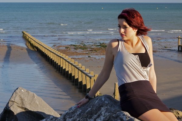
Below is an extreme example of a high horizon – I chose to include it because it focuses the interest onto the subject and foreground below.
It makes it look as though the visual weight of the subject forces the camera down, at the same time keeping the photo stable by remaining straight across the top of the frame. There’s a lot going on in the lower half of this photo and the inclusion of the sky would have distracted from this.A girl in a beach setting to show A cityscape to show Horizon Placement

Low Horizon

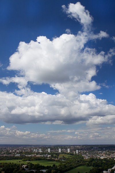
Photos of clouds from below can be pretty boring and rely heavily on being ‘pretty’ for attention. If you raise your angle, the clouds rely more on their shape and form to attract viewers.
Because I had a higher vantage point and the shape of the clouds was particularly interesting, I chose to include as much of them as possible, which meant using a lower horizon.
I included just enough of the ground to make the colour interesting and complimentary to the colour of the sky, while focusing most of the viewers attention towards the subject: the clouds.A portrait of Horizon Placement
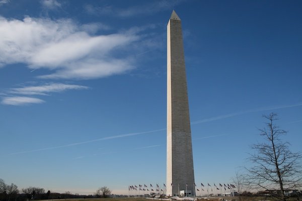
This is an example of a very low horizon. I chose to take the photo this way not because I wanted to emphasis to be on the rather uninteresting sky, but because I wanted to focus on the dominance of the building.
With the horizon that low, the feeling of balance is lost which draws your attention towards the bold building standing on top of it. By removing many other potential features from the frame, you focus the attention onto one specific point – the building.An image of an obelisk to show horizon placement

-----------------------------------------------------

Free Photography Ebook

Camera Basics Series: Shooting Modes Explained – Free Quick Guide


There probably isn’t a more confusing and misunderstood topic on the camera side of photography than the shooting modes.

Shooting modes may be incredibly confusing to people just starting in photography; after all, there are so many letters and icons on that mode dial! What do these letters and icons mean?

Good question! And the sooner you understand them; the earlier your photography will improve and become more predictable.

This is what will be covered in this guide:

  • Auto Mode
  • Program Mode
  • Shutter Speed Priority Mode
  • Aperture Priority Mode
  • Manual Mode
  • The differences in the Nikon and Canon mode dials
  • A note on Scene Modes

There are those that believe that the manual mode is the only mode that a real photographer uses.

We don’t believe that. There are reasons that all of these different modes are available to photographers, even on the most professional level DSLR cameras.

Each mode has a purpose.

Are you ready to learn about them? Let’s go!

Photo Credit: Angela Fulks

 
---------------------------------------------------------------------------------------------