Seeing squares: why shooting square format can transform your landscapes
Tags: Photography for Beginners, Photographer, Medium Format
By Yan Zhang
But as time went on, I started to realize that the square is a powerful composition ratio, which, when applied effectively, can produce amazing images. Let’s start with the history.
The origins
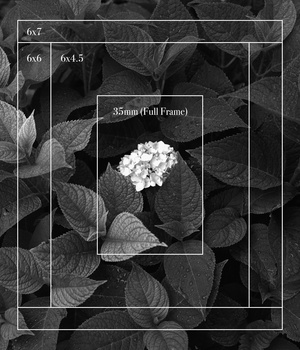
Before the digital era, most medium-format cameras were made to shoot
in square in terms of the aspect ratio of the frame. In fact, the first
square medium format camera, Rolleiflex, was introduced in 1929.
Other
well-known medium format camera manufacturers, such as Hasselblad,
stuck to the square format in their film cameras for a very long time
until they started to make digital medium format cameras in the early
2000s.
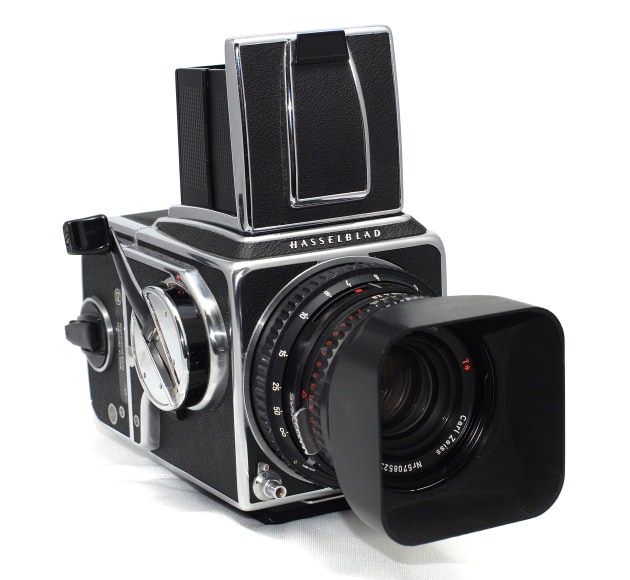
There was a technical reason why the film medium-format cameras used the square aspect ratio. Since the design of most of these cameras made it hard to turn the cameras onto their sides to take photos, the square format was the most practical aspect ratio for photographers to use.
From a compositional viewpoint, a square format certainly has its advantages. It presents a perfect balance on all sides of the frame, which is particularly good for shooting portraits and some specific landscapes such as seascapes.
However, the square aspect ratio has never been used in 35mm SLR
cameras. With the surge of digital technology, most digital
medium-format camera makers, including Hasselblad, have also switched to
a rectangular 3:2 aspect ratio.
Although some digital cameras
have embedded aspect ratios which photographers can choose when taking
photos, such as the 9:4 and 1:1 aspect ratios, the camera sensors
themselves are designed for the 3:2 aspect ratio frame.
So why should you shoot square?
Lines, shapes and space
In landscape photography, square compositions are particularly useful when lines, shapes and space play prominent roles in the scene.

Lines
You will likely already know that lines can play an effective role in
leading the viewer’s gaze around your frame. There are a number of ways
the square format can also take advantage of this. The 1:1 ratio lends
itself well to subjects placed centrally, and lines can be useful for
guiding your viewer right to the centre of the image.
Diagonal
lines can also work well in the square format, especially if they divide
the frame symmetrically. For the best results, try to form at least two
leading lines from both sides pointing to the central subject or focal
point.

Shapes
The square format can be an effective way to simplify an image, and lends itself well to minimalist subjects that emphasise shape and form, without focusing too much on subtle details. The human eye is also naturally attracted to geometric forms.


By using a square format to symmetrically balance the elements within the frame, it can make the subject much more appealing visually. And, as the width and height of a 1:1 crop are equal, the square format can also be used for displaying both horizontal and vertical subjects, such as waterfalls.
Space
Another interesting feature of the square composition is its effective way of dealing with space. This is particularly true in seascape photography. Quite often, the sky is a critical component in seascapes, and keeping a balanced portion of the sky when taking photos of the ocean is important.

Sometimes, you only need a small part of the sky in the frame – for example, 1/3 or less of the overall frame. Other times, you may need to have the sky dominate the whole scene. In both situations, you will likely find that a square composition has visual advantages over the traditional 2:3 aspect ratio in either landscape or portrait format, giving greater balance to the frame.
Capturing grand landscapes
While the square is a powerful composition format when photographers deal with lines, shapes and space in natural scenes, it is also effective when capturing “grand landscapes” such as mountains and rivers.
Instead of cropping a 2:3 aspect ratio image into a 1:1 ratio, by using a different approach, you can use the square format to capture grand, yet complicated, natural scenes that are not possible to create via a single 2:3 aspect ratio frame.

You may have come to a place where there are a number of appealing natural elements you want to compose into the frame, but a single frame is not big enough to contain all of them. In this case, two shots at a 2:3 aspect ratio (usually in landscape format) can be taken separately to cover different parts of the scene, and then seamlessly integrated into one square-framed image through post-processing. I call this approach the combined square composition. You can think of it like a panorama, but with just two images.
There are at least two scenarios where this approach can be useful. The first is when you do not want to compromise on the portions of both foreground and background using a 2:3 aspect ratio frame. For example, if the foreground and the far away mountain and sky are of a similar size that you want to capture, then the combined square composition may be an ideal option.
The second is simply when you need to take a larger picture. For instance, you may find yourself in a constrained shooting position – for example, on a mountain ridge, river bank, or edge of an ocean cliff – where you are very close to the subject you want to shoot, but have little space to move around to compose.
How we view images
The square format doesn’t just affect the frame – it also changes the way a viewer looks at an image.
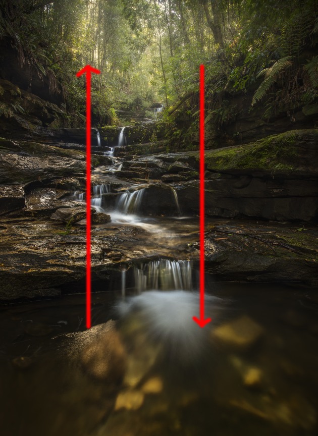
In the portrait format, such as this image captured at Terrace Falls, in the NSW Blue Mountains, the eye moves up and down the frame as it explores the image.
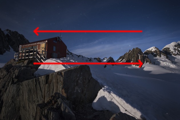
This is different to the rectangular frame, where the eye is encouraged to move from side to side, as in the image captured at New Zealand’s Fox Glacier below.
The square format, as seen below, encourages the viewer’s eye to move around the frame in a circle, and also to land right in the middle of the frame, particularly if the elements have been arranged with care.
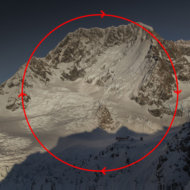
Understanding how a viewer will look at an image is a useful tool for laying out key points of interest in your frame. In a square format, this may mean centralising your subject and avoiding placing key parts of the frame in the corners. Share this article.
----------------------------------------------------------------------------------------------------------------------------
PHOTOGRAPHY FREEBIE:
How to make money with your Photography even if you're not a Pro.
Copy & paste this link into your browser, click ENTER, and enjoy:
https://mrdarrylt.blogspot.com/2020/01/how-to-make-500-month-from-your.html-----------------------------------------------------------------------------------------------------------------------------
Visit me on Facebook and post your pictures.
https://www.facebook.com/Darryl-T-363867387724297/