Thursday, July 16, 2020

Try Out These Awesome Photography Printing Mediums for Fantastic-Looking Photos

Photography Printing Mediums, Nikon, Travel Photography, How to avoid photography problems, bad mistakes, photography, video. Photography tutorial for beginners, photography, photography tips, photography tricks, photo tips and tricks

An awful lot of blog posts focus on the mechanics of the photograph. They discuss composition, shutter speed, aperture, etc.  Other posts talk about post-processing and making an image into a piece of art. Do a search and you’ll find hundreds of articles that show you how to clone, or how to use HDR. There’s a third section to this whole process of photography that so many forget to discuss. The digital age and social media have given us another way to share our art. We post the photograph online-only worrying about how it appears on the screen. We’ve forgotten that part of the beauty of our work is more concrete. We have forgotten how amazing it is to print our work, so this article will look at photography printing mediums.
Photography-Printing-Mediums
Image by andreas160578 from Pixabay
If we do print our work, we tend to choose something standard. We upload our work and look for a cheap frame. It’s done. We don’t think very much about the photography printing mediums we use when printing our work. There’s so much we can do now. The media used to print a photograph is just as important when creating art as the first two stages of the process. We should consider all three as vital to the process.
Let’s consider some of the following photo printing mediums and the effect they can have on your work. The same photograph print on two different types of photo printing mediums can have a totally different look.

Luster photo paper

Luster paper has a slight sheen to it. The paper is similar to the idea of semi-gloss paint. Luster paper is easy to find in standard photo printing locations. The paper will produce beautiful colors, and it’s cost-effective. There is a subtle texture to the paper, and when framed, there’s less glare.
These factors are important when considering the look you want to create. Luster works well for portraits. Quite often family and wedding photographers recommend it to clients.

Glossy photo paper

Glossy used to be the go-to photo paper. Most of the photographs around my parent’s house are printed on glossy paper. Glossy tends to produce colors that are richer than luster. The details are also very sharp. In general, the image feels bright.
Many people don’t like the glossy feel of the paper. The sheen, depending on the angle can make it hard to see the photograph. Glossy also has a tendency to show scratches.
Portrait photograph printed on lustre paper
For family photos like this one, I usually recommend a luster or matte paper.

Matte photo paper

Matte paper has no sheen. The look is flat. That’s not to mean it’s boring. Matte paper can be very beautiful. It tends to create a somewhat softer look. Prints on matte paper tend to age better than those on luster and glossy paper, and the paper doesn’t show fingerprints the way glossy products will. You can also get some very beautiful prints from matte papers.

Uses for these papers

These papers tend to be used for nature photography, portraits, and weddings. Some photographers also use them for art prints. It’s important to consider the effect you want to create.
As an example, I printed the image below on a glossy paper. The fabric of these ribbon skirt has a natural sheen to it. If I had used a paper with no sheen I would have lost this element, and I wanted to represent the skirt as accurately as possible.
A woman's traditional ribbon skirt
If you notice the sheen on the fabric you’ll see why I specifically chose gloss paper for printing.

Textured art paper

I will admit that textured papers are my favorite type to use when printing art photographs. I love the effect the paper creates. My favorite brand is Epson Cold Press Natural, but there are many available. A little experimentation will help you find your favorite.
Epson Cold Press is a textured matte paper that feels similar to watercolor paper. It’s thick and it absorbs a lot of ink. This paper tends to evoke an emotional response from viewers. I know that sounds strange, but I find the colors richer, and they have more depth. As a result, people tend to be drawn to the work. People often ask how the colors in the work are so rich. Good quality paper really helps produce a striking image.
Photography-Printing-Mediums
In the following photograph, you’ll notice the rich black background. Printing on this paper lets me lay down a lot of ink to create an intensity I wouldn’t be able to otherwise produce.
Photography-Printing-Mediums
This still life was shot with a piece of black velvet in the background. The intense black is important 
to the composition.

Still life photographs on black velvet

Printing on wood

This is a unique process.
You’ll have to look online to find a company that prints right onto the wood. I’ve used Posterjack in the past.
Photography-Printing-Mediums
I’ve used Posterjack to do wood prints.
The effect is interesting. The wood grain will show through your images. It’s a unique look that can elevate the right photograph to new levels. One artist used wood prints quite effectively for an exhibition. The exhibition focused on the destruction of the rainforest for the production of beef. He photographed cattle then used the wood prints to help emphasize his message. In this case, the wood medium added to his exhibition.
While you may not be creating an exhibition for a gallery, the medium could still enhance your photographs. The wood grain works nicely with nature images as well as something with a retro feel to it.
Photography-Printing-Mediums-Rocks and birch bark for a nature photograph
This image works well with the wood grain. Images with limited texture that needs boosting, also 
work printed on wood.

Acrylic prints

Beautiful rich colors with sharp details work brilliantly on acrylic.
The images will pop and get noticed by anyone who walks into the room. The downfall with acrylic is you have to be very careful – it’s easy to chip the corners on an acrylic print.
Acrylic works very well with images shot at night. The bright lights of a city set against a dark sky can be breathtaking in acrylic.
Night image
This image works so well on acrylic. The glossy nature brings out the intensity of the city lights.

Metal prints

Metal prints, when used with the right image, can create amazing, jaw-dropping images.
Wherever an image has pure white, the silver of the metal will show through.
When used with black and white images, this creates a very unique look. The image also feels very modern. Content like urban landscapes or abstracts of machinery looks striking on this type of media.
Industrial feel to this image
This image looks awesome on metal. The silver works so well and adds depth to the image.

There are loads of photography printing mediums out there for your photographs.  I haven’t even mentioned canvas prints or printing on fabric. Both are pretty awesome options as well.
The reality is, the sky’s the limit.
It’s more important to consider what each medium could do for your work. You should also think about how the medium affects the look of your work. Do you want a retro feel? Maybe you want something muted and understated? Think of a photograph as something with its own unique voice. Let the image, and the message you want to convey, speak to you then consider how you can make the work shine. As I’m sure Yoda told Luke at some point in Starwars, “Choose wisely, have patience, the answer will come to you.”
Do you have any other photography printing mediums tips you’d like to share with us? Do so in the comments!  Share this article.


https://bit.ly/2JzXFdk

Wednesday, July 15, 2020

What Are Burning And Dodging And How They Can Help Your Photos

Dodging and Burning, Nikon, Travel Photography, How to avoid photography problems, bad mistakes, photography, video. Photography tutorial for beginners, photography, photography tips, photography tricks, photo tips and tricks
When teaching modern digital photography I often forget those new to the general art of photography might not be familiar with classic terms and techniques and I need to take a step back. This post is for those who might have always wanted to ask, “What do people mean when they say ‘burn’ and ‘dodge’ in post-processing?”. If you can still smell the darkroom fumes when I bring up these terms, you can skip over this post.
Burning and dodging are two darkroom techniques used when printing a picture. A negative is placed in a projector and then pointed at a piece of photo paper (much like a slide projector projects an image on a screen). That photo paper is not like the paper you might be used to printing on at home now. It is light sensitive, just like film, and that is the whole reason for creating a darkroom; to control the amount of light hitting the paper which will expose it.
Now then, light from the projector passes through the negative and then hits the paper. The timing of the light exposure is controlled to certain tolerances just as the original exposure of the scene onto the negative was controlled. Light hits the negative evenly and then hits the paper evenly. This works well if the scene is even balanced. But what if there are areas that need to be lighter or darker? That’s where burning and dodging come in and they are simple.
The key to these terms and understanding them is to remember that the paper is white. Dodging is the process of covering over part of the light hitting the paper, creating a shadowed area that does not receive the same light exposure as the rest of the scene. Because this decreases the amount of light hitting the paper (remember; light hitting the paper = darker exposure), it lets more of the white paper show through, effectively lightening the image in that area. Burning is the opposite, it is only allowing light into one area of the image to increase the exposure time in that region and create a darker image for that area.
Both employ various methods of covering, from simply using a hand or piece of paper to creating custom templates. Further, the edge of the dodge or burn can be softened by moving the covering slightly as the paper is exposed.
All of this allows a photographer to create different exposures throughout one frame, which can more closely mimic the scene as it was when shot, or to use artistic expression to alter an image to one’s liking.
Now then, how can you use these techniques for your own gain in the modern age?
I’m going to show these techniques in use on Adobe Lightroom but they can be practiced on any program which allows for selective masking and exposure changes.
First, the image from a recent review of a Sigma 50-500mm lens (click on any image for a larger version).
DPS1
The shot was taken with an iPhone and exposed for the lens with gray, overcast skies. I want to highlight the lens and diminish the background. The first thing I do is choose the Adjustment Brush and the Burn feature as such:
DPS2
DPS3
For this photo, the Burn setting is not dark enough for me, to be honest. I take the Exposure for this mask to -1.17 and this is the result:
DPS4
The camera and lens are now darker, helping them stand out better against the background. I now want to do the opposite with the background. I want to dodge it to lighten it, further highlighting the lens. I start by painting a mask of the background:
DPS5
Again, the Dodge is not to my liking and I instead change the exposure for this mask to be lighter.
DPS6
With these masks, I can also change contrast or brightness (done away with in Lightroom 4) to further highlight my subject if I liked. In this example I am keeping things simple.
The result is slight, but can be more dramatic if need be.
Before:
PeterWestCarey-CameraAwesomePhoto(4)-2
After:
PeterWestCarey-CameraAwesomePhoto(4)
Burning and Dodging have been around as long as making prints has been an art form where the photographer wished more control over their medium. The techniques are still highly relevant in today’s modern, digital era and I now hope you have a better understanding of where the terms came from and how best to use them.
Thank you for reading.  Share this article.

https://bit.ly/2JzXFdk

How to Enhance Portraits Using Gray Layers to Dodge and Burn in Photoshop

Dodge and Burn, Nikon, Travel Photography, How to avoid photography problems, bad mistakes, photography, video. Photography tutorial for beginners, photography, photography tips, photography tricks, photo tips and tricks

What is dodging and burning?

The techniques of dodging and burning are hand-me-downs from the days of the darkroom. The idea was to manipulate parts of an image while the paper was being exposed to light from the enlarger, where the negative was fitted. In order to decrease the exposure (lighten) on parts of an image, the paper had to be exposed for less time, which was dodging. To increase exposure (darken) it needed to be exposed for more time, which was burning.
Before dodging and burning

After dodging and burning (it’s subtle, look at her hair and cheeks – don’t overdo it with this technique)
One way of doing this, was by holding bits of paper or card over the parts of the image that didn’t require manipulation. Because these adjustments only applied to certain parts of an image, it required a certain amount of dexterity (as well as a lot of paper) to get right. Because of this complexity and precariousness, dodging was used primarily to lighten dark areas. Burning was then used to darken highlight areas.
The Photoshop version of the technique; however, is far more forgiving. Photoshop allows very fine control over an image and even allows pixel by pixel retouching. The versatility this provides turns the traditional darkroom method on its head. It allows you to use small brush strokes to brighten and exaggerate small areas of highlights, or darken shadows, instead of applying to only broad areas.
This technique is very easy to learn, but it does require some practice to get down, as it’s very easy to go overboard with it, and overcook your images.

Why dodge and burn?

Tools like curves and levels give you control over the tonality and contrast of an entire image (excluding the use of layer masks). This is called a global adjustment, but they aren’t always effective for most images.
Dodging and burning allows you fine control over the tonality of your images in small, concentrated areas. These are called local adjustments. This allows you to pick out small parts of an image to work on, while leaving areas that need no work untouched.
While useful in all genres of photography, the use of local adjustments comes into its own in portraiture. If you think in terms of contrast alone; hair, eyes, skin, and clothes all require very different treatments in order to look their best. For example, if you pump up the contrast in an image to make a pair of jeans look punchy, that will wind up destroying the skin tones in your portrait. One of the easiest ways to overcome this is using a local adjustment technique like dodging and burning.
This tutorial will get you started with a two layer dodging and burning technique, that will give you far more control over your images than you would have with global adjustment tools alone. This is an intermediate technique and you need to have a basic understanding of how to use layers in Photoshop.
For this demonstration, I am going to go beyond what I would normally consider acceptable and overcook the image, to ensure that it is visibly clear what is happening at various stages of the process.

Setting up the layers

Before you start this technique, I suggest that you first finish any blemish removal in your image.
That said, the first step in Photoshop is to create a new layer by going to Layer>New Layer or by pressing ctrl+shift-n. Rename this layer, “Highlights”.
dodging-and-burning-with-grey-layers-newlayer
With this new layer selected, go to Edit>Fill or shift+f5 and choose 50% gray from the menu. Press OK. Your image should now be entirely gray.
dodging-and-burning-with-grey-layers-fill
dodging-and-burning-with-grey-layers
The next step is to change the blending mode of your gray layer. From the drop down menu in the layers palette, choose Overlay or Soft Light. Either choice is fine, but using Overlay will result in a far more pronounced effect than Soft Light. Experiment with both, see how it works for you, and which you prefer. Once the blending mode is changed, you should be able to see your image again.
dodging-and-burning-with-grey-layers-softlight
Next, create another new layer. Layer>New Layer or ctrl+shift+n and rename it to “Shadows”.
 Again, fill it with 50% gray. Edit>Fill>50% Gray or shift+f5
dodging-and-burning-with-grey-layers-layers
Set this layer’s blending mode to the same as the one you chose for your Highlight layer.
That’s the preparation work done. Once you’re used to it, this whole process only takes a few seconds. It’s also possible to set it up as an action, so Photoshop will do it for you at the press of a button.

Dodging

To start, select your Highlight layer and choose the brush tool. Pick a large, soft brush (Hardness number is low and edges are fuzzy). You can change the brush settings by right clicking within your image.
dodging-and-burning-with-grey-layers-brush
With the brush selected, look for the tool settings at the top of your screen. You’re looking for a pair of sliders labeled opacity and flow. Set your brush’s opacity to 15% and the flow to 10% (see below circled in red). You can change them later, but this is a good starting point.
dodging-and-burning-with-grey-layers-brushopacity
Make sure that your brush colors are set to white and black. You can press D (default) on your keyboard to do this. Also, you can press X to swap between them. Knowing these shortcuts will save you an incredible amount of time.
Now you’re ready to dodge.
Assuming you’re working on a portrait, find a highlight area on your subject’s skin that you would like to emphasize. With white set as your foreground color, paint into that area (make sure you are on the Highlight layer not your image). Because the brush’s opacity is so low, you may not notice a difference at first. Just keep brushing into it, and build up strokes until you have the desired effect. Do this for all of your highlight areas.

With the blending mode set to normal, your highlight layer may look something like this.
Note: If you decide that you’ve gone too far, just fill the layer with 50% gray again and start over.

Burning

With your highlights done, select your Shadow layer by clicking on it in the layer palette. Select black as your foreground color and paint into the shadows in the same manner you did for your highlights (make sure you are painting on the Shadow layer not your image).

With the blending mode set to normal, your shadow layer may look something like this.

After dodging and burning is complete, you may have something that looks like this.

Add Gaussian Blur

The next step is to smooth out your brush strokes. Select your Highlight layer and select Filter>Blur>Gaussian Blur. Choose an amount between 20 and 40 pixels, and press okay.
dodging-and-burning-with-grey-layers-gaussian

After the Gaussian Blur filter is applied.
Do the same for your shadow layer.

Final Steps

The last thing to do is is change the opacity of your layers. It may not seem like it, but at this point the effect is probably way too strong.
Select one of your painted layers. Find the opacity slider in the layer palette, and drag it to the left. Watch your image as you move the slider and stop once you’ve reached the desired effect.
dodging-and-burning-with-grey-layers-layeropacity
Do this for the second layer, and that’s it! You have dodged and burned.

The final image after the opacity of the dodge and burn layers has been reduced.
It's really easy to overcook an image with this technique. Use low opacity brush strokes and take your time to avoid having your images look like this one.
It’s really easy to overcook an image with this technique. Use low opacity brush strokes and take 
your time to avoid having your images look like this one.

From Left to right: 1) Before 2) Dodge and burn with no blur. 3) Gaussian Blur filter applied. 4) 
Opacity of dodge and burn layers reduced.

Tips and Notes

  • Like most retouching techniques, subtlety is key. At first, overcooking your images with this technique is inevitable. Keep practicing and you’ll figure it out in no time.
  • Always zoom in to 100% or closer when working on small areas like eyes.
  • A graphics tablet will help with smooth, natural brush strokes. If you can only use a mouse or trackpad, experiment with more liberal use of Gaussian Blur to mask the brush strokes.
  • When painting shadows or highlights, try to match the light in the image. You can paint white (dodge) into your shadows, but this will probably look very strange in the end.
  • Change the brush size often, and appropriately, to the area you are working on. Keyboard shortcuts make this a breeze (use [ and ] to increase and decrease brush size).
  • Experiment with different brushes until you find one that suits your taste.
Before dodging and burning

After dodging and burning

More Tips and Notes

  • It’s all too easy to concentrate on the face, but try not to forget other parts of the image like your subject’s hair, clothes, and the rest of their body.
  • Both dodging and burning can be done on a single gray layer. Feel free to do this, but the two layer technique grants you even more control, without much extra effort.
  • Consider setting up a keyboard shortcut for Gaussian Blur. This saves a lot of time.
  • You can create as many sets of gray layers as you want. For example, if you want to use very small brushes to dodge and burn the eyes, you might choose to do this on a separate set of layers in order to use less blur at the end. If you use a lot of layers sets like this, consider using layer groups to keep them organized and don’t forget to name your layers.
  • If the shadows and highlights you are working with have very hard edges, try using a harder brush and a lower amount of Gaussian Blur.
  • Consider watching and trying some digital painting and sketching tutorials for Photoshop. These can really help to increase your brush control and lend to more natural results.  Share this aricle.

https://bit.ly/2JzXFdk
 

Tuesday, July 14, 2020

The Nikon Z5 Will Be Announced on July 21st


If you’ve been hoping for a more affordable full-frame mirrorless option from Nikon, you don’t have long to wait.
According to Nikon Rumors, we will likely see the launch of the new Nikon Z5 on July 21st, a camera that will be positioned beneath both of Nikon’s current mirrorless models, the Nikon Z6 and the Nikon Z7.
Any new Z-mount camera would be a welcome addition to the Nikon mirrorless lineup, which currently consists of two full-frame bodies (the Z6 and Z7), as well as the APS-C Z50. And while all three of these cameras are worthy of praise, the lineup still contains quite a few gaps, such as an action-centric “professional” body, a true entry-level APS-C body, and a more affordable full-frame model.
Enter the Nikon Z5, a camera with the potential to energize Nikon fans, especially shooters that are on the fence about switching to mirrorless.

What can you expect from the Z5?


Nikon to release Z5
While there is no official word from Nikon on the camera, rumors suggest that the Z5 will offer a lot of the same features as the Z6, including:
Interestingly, it’s looking like the Z5 will also offer dual SD card slots, perhaps in response to the criticism Nikon took over the lack of dual slots in the Z6 and the Z7.
Of course, for the Z5 to stay reasonably priced, Nikon will be making some cuts, including continuous shooting speed (expect 6 frames per second, rather than the 12 fps you get with the Z6), the loss of full-frame 4K video (there will likely be a substantial crop), as well as no top LCD.
But the Z5 is still looking to be an impressive camera, even if it’s not as action-capable as the Z6.
What’ll be interesting to see is how Nikon’s new camera stacks up against the Canon EOS R6, which will debut just weeks before the Z5, and will be positioned below the Canon EOS R5, as well as (likely) the EOS R. There’s also still the Canon EOS RP, which is very much a lower-priced full-frame option, even if it may become far less interesting after the launch of the R6.
Bottom line:
If you’re a photographer hoping to go full-frame, or you’re already a Nikon full-frame photographer seeking a mirrorless option, then keep an eye out for the Z5 announcement; if the rumors are true, then it’ll be one very impressive camera!
Now over to you:
What do you think about the upcoming Z5? What do you expect it’ll offer? What do you hope it will offer? Share your thoughts in the comments!

https://bit.ly/2JzXFdk

How to turn dinner into a great commercial shoot

Lockdown phenomenon, Travel Photography, How to avoid photography problems, bad mistakes, photography, video. Photography tutorial for beginners, photography, photography tips, photography tricks, photo tips and tricks


Published by
The coronavirus pandemic has ushered in a new wave of home cooks, who are whipping up everything from handmade pasta to DIY pizza dough. According to Google Trends, interest in banana bread and brownies, “Dalgona coffee” and lasagna, and more is on the rise, as people search for new recipes to try right now.
You already know bread-baking has become a lockdown phenomenon, but did you know that King Arthur Flour experienced a 2,000% rise in flour sales in March? According to The Washington Post, the company also received 22,000 messages from social media users so far this year, a significant increase when compared to the 10,000 total they received in 2019.

Tips For Making Homemade Bread by Store-2 Old-Guys on 500px

Market research suggests that even after the crisis ends, 32% of Americans plan to make more home-cooked meals; of the 33% who have been baking more than usual during this period, 20% plan to continue into the future.
Right now, it seems everyone is cooking or baking—and sharing pics of their creations. Lifestyle brands, cooking blogs, and advertisers are no exception, and authentic, at-home food photos are especially appealing to a commercial audience.
Being stuck at home might seem like a limitation, but it’s also an opportunity to create marketable photos on a budget, right from your kitchen. Here’s how to turn a simple daily activity—like cooking dinner—into a commercial photoshoot.

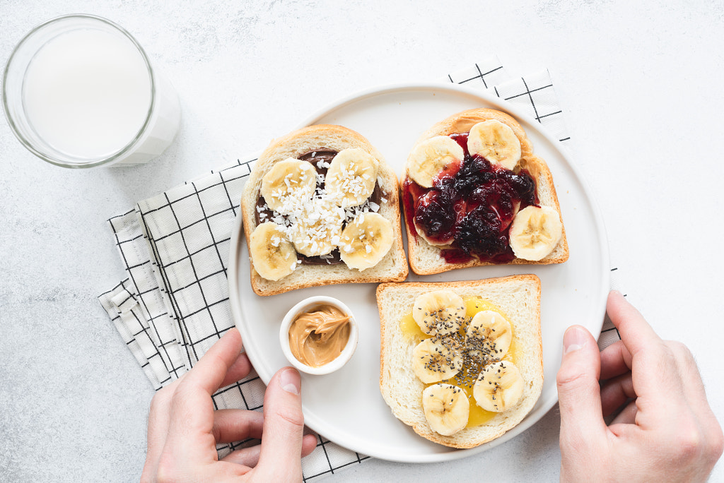
Vegan nut butter toasts with different toppings by Vladislav Nosick on 500px

Highlight the ingredients

A recent survey by Berstein suggests that during this pandemic—and after it’s over—consumers plan to eat more fresh and plant-based foods, with 38% craving “real food with simple ingredients.” 60% of respondents report cooking more from scratch.
Over the last few years, consumers have increasingly pushed for access to information about what’s in the food we eat, whether it’s in the form of GMO labels or details about sustainable farming practices.
For commercial photographers, illustrating this shift could mean incorporating simple, healthy ingredients into trendy top-down pictures of deconstructed meals. Source fresh produce from local stores, and show us how your favorite recipes are made. If you have access to unusual ingredients, use them!

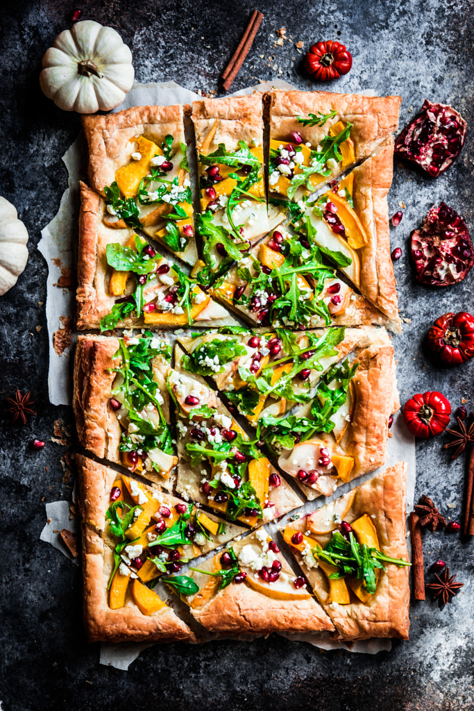
Autumn tart with pumpkin, pears,arugula and pomegranate seeds on by Alena Haurylik on 500px

Add a pop of color

Speaking of plant-based food and farm-fresh ingredients, Getty Images named veganism as one of their top visual trends for last year, so take advantage of colorful fruits, vegetables, and garnishes. Natural colors can also help convey larger concepts like health and wellness, both intricately connected with how we view and understand food.
With home gardening also on the rise (another lockdown hobby), there are more opportunities than ever to access vivid, saturated ingredients for your food photos. Consider keeping greens in a damp napkin and sticking them in the fridge to help preserve those colors. Use a little bit of olive oil to add some shine.

Start with natural light

You can always add in additional light sources later, but start by scouting your house for beautiful window light (if you have a sliding door, that’s another great option). Depending on the look you want, you can make the light soft by using curtains as diffusers or bring in a reflector to bounce light back onto the food. You can get warm colors by shooting at the golden hour or wait for bluer light at twilight. Think of your home as a studio (minus the budget), and experiment with every room and time of day.

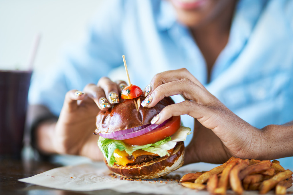
close up of african american woman about to eat vegan meatless cheese burger at restaurant by Joshua Resnick on 500px

Collaborate with roommates

The people behind the food are often just as important as the meals themselves, so ask your roommates or family members to sign a model release, and include them in your photos.
“Photos with models often sell more than those without, so including people can give your photos an edge,” the 500px Content Team tells us. “Capturing authentic ‘micro-moments’ can be great if you have someone to model for you. Even solo, a hand reaching into frame to stir a pot or open an oven can bring a lot of life to a photo.”
These “micro-moments” can be as simple as squeezing lemons or passing a plate around the table. Remember to cook something you love, whether it’s an old family recipe or a traditional dish from home. Your connection with the food will add a touch of familiarity and warmth to your images.

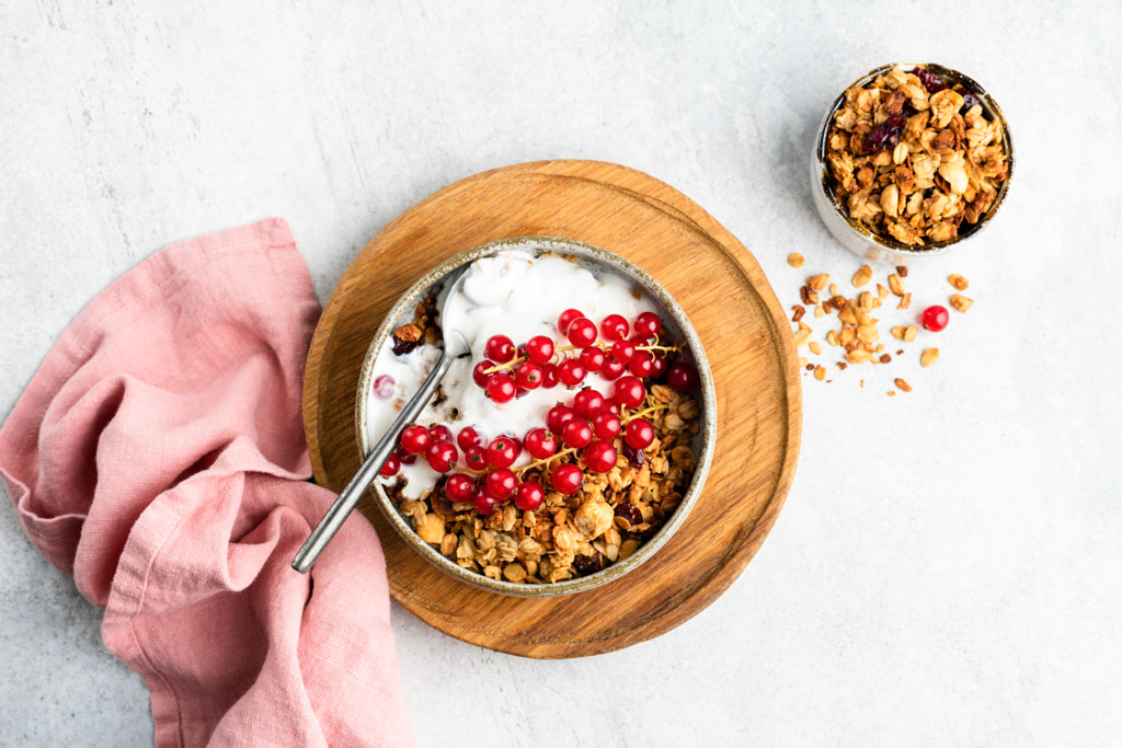
Breakfast cereal oat granola with yogurt and berries by Vladislav Nosick on 500px

Get messy

As the public looks for more transparency and sustainability in the brands they support, “imperfection” is in vogue; last year “ugly-produce boxes” from companies like Hungry Harvest, Misfits Market, and Imperfect Produce made a splash by buying up farmers’ excess product and shipping them to customers. Today’s consumers are tired of artificial perfection, and marketers are taking note.
We touched on this idea earlier this year in our 10 tips for better commercial food photography article, but, in general, food photography (and stock photography in particular) is moving away from the staged, pristine look and towards a more candid, real-life aesthetic. Sterile white backgrounds have been replaced with warm and rustic ones.
Food styling these days feels more natural, so lean into that. Check out leading magazines and blogs like Food & Wine or Minimalist Baker, and you’ll see just what we mean, from overflowing avocado toast to gooey cupcakes one bite already gone. You might still want to bring out the tweezers and cotton swabs for styling, but if it’s not picture-perfect, that’s alright.

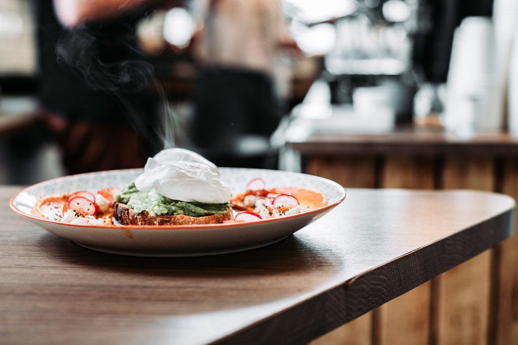
Steaming fresh dish by flyinghamstercreative on 500px

Make it personal

Due in part to the surge in YouTube cooking channels, the idea of “showing the process” behind the food is trending in commercial photography. More people are taking up cooking during lockdown because it’s a fun, budget-friendly way to pass the time, but it’s also soothing.
As of this writing, #stressbaking, #quarantinebaking, and #bakingtherapy have racked up tens of thousands of posts on social media, and experts say the trend could be due to the calming and meditative effects of working in the kitchen. Photos of people preparing ingredients, kneading dough, and plating their creations give us a window into that process.
Viral videos by Tasty are a great example of this method in action; they reveal how food is made, and they’re also pleasant to watch (the food writer Dayna Evans once called them “calming one-minute meditations”). To channel this effect, cook or bake with your hands and include them in your photos.

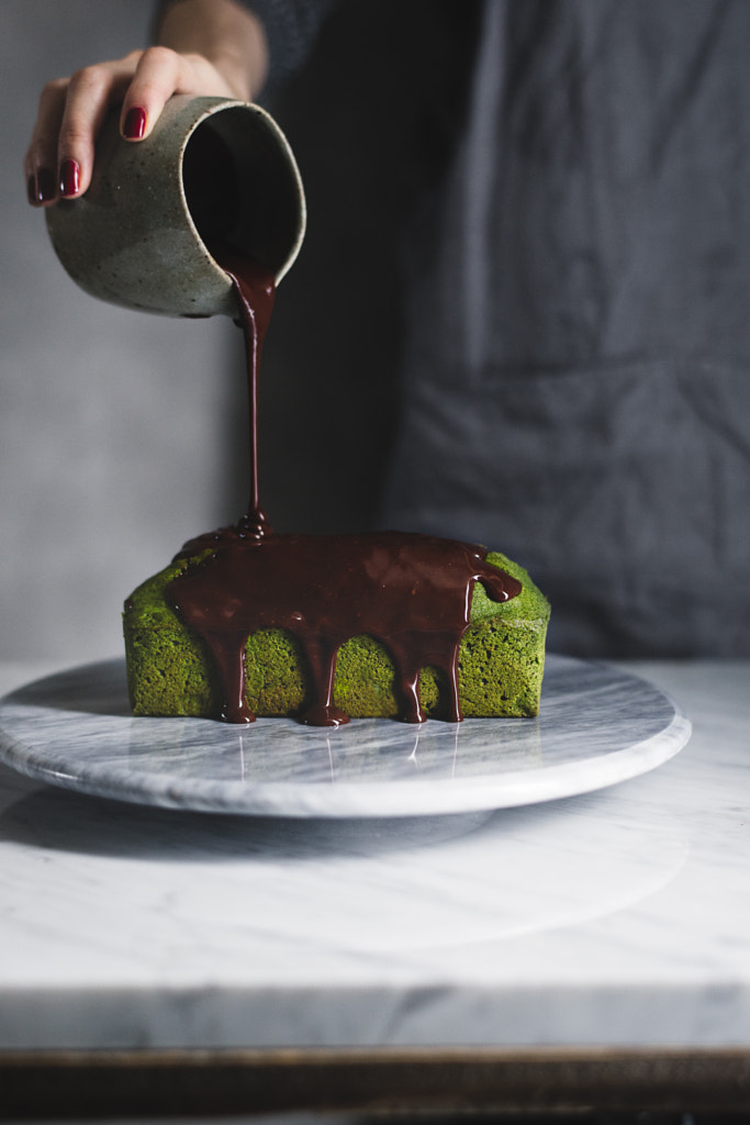
matcha pound cake with chocolate. by Miki Fujii on 500px

Focus locally

A local focus goes hand-in-hand with a personal touch, so convey a sense of atmosphere and location in your photos. Food tells us so much about the places where we live and travel, their cultures and flavors, so remember to include elements that are unique to you. Maybe it’s your ability to source gorgeous ingredients from a local market, or perhaps it’s your grandmother’s vintage silverware. Highlight signature details that reveal the setting and the context.

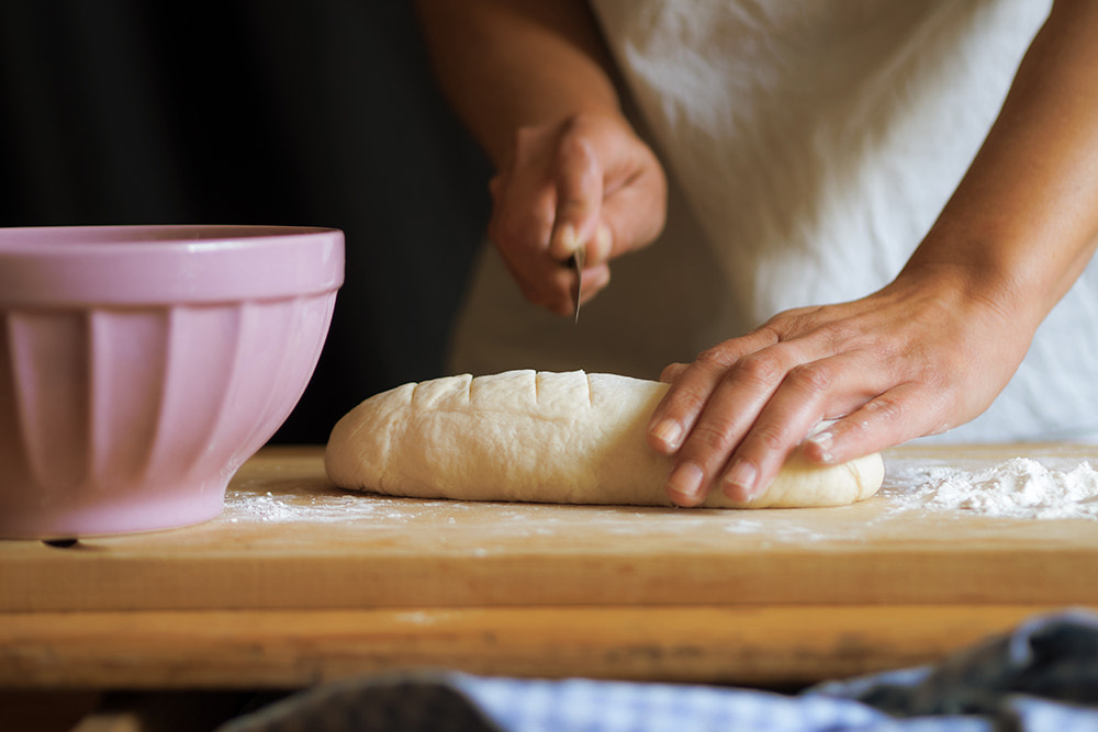
forming the loaf by Susanne Ludwig on 500px

Keep your camera out

One of the easiest mistakes to make on a food shoot is focusing only on the final, plated product and not everything else that happens in the periphery: the selection of ingredients, the boiling of pots, the waiting at the oven, the first bite, and the conversation shared over dinner. These are all part of conveying a larger narrative, and it’s often those moments that brands look for when searching for photos.
Before your shoot, write down all the scenes and situations you want to photograph over the course of dinner, and refer back to that shot list frequently. If you see something that isn’t on your list, photograph it anyway. Don’t be afraid to improvise and experiment with new angles. Take a bite, and then take more photos. The more shots you get, and the more diverse and varied they are, the stronger your Licensing portfolio will be.

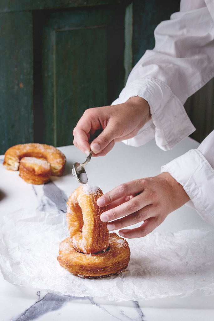
 Puff pastry donuts cronuts by Natasha Breen on 500px

Look towards the future

As part of a special edition of their annual report The Future 100, the global agency Wunderman Thompson identified “future-proof ingredients” as one of their top trends for this year.
Lockdown measures have forced us to prioritize long-lasting foods; in the United States, for example, sales for dried beans rose by 231% in March, when compared to last year, and 86% of customers are stocking up on frozen foods. Over in the United Kingdom, sales of canned pasta and pot noodle snacks increased by 226% and 150%, respectively.
With more people staying in and cooking at home, these pantry staples will continue to crop up in recipes, and that’s something to keep in mind. Follow food blogs and magazines, and incorporate some of the industry’s biggest movements—from veganism to sustainable packaging—into your photography.  Share this article.

https://bit.ly/2JzXFdk