Tuesday, September 17, 2019

7 Tips for Stunning Black and White Photography (Comprehensive Guide)

How do you achieve stunning black and white photography?
stunning-black-and-white-photography
Black and white photography is one of the most intimidating genres out there, mostly because it’s associated with lots of established names, as well as the “fine art photography” label.
But here’s the thing:
Black and white photography isn’t actually difficult. In fact, it’s just like any other genre of photography: There are a few tips and tricks that, once you apply them to your shooting process, will instantly improve your black and white photos.
And that’s what this article is all about. I’m going to share with you seven tips for stunning black and white photography. And you’ll come away with the ability to take masterful black and white photos wherever you go.
Sound good?
Let’s dive right in:

1. Shoot in high-contrast light for the most impactful photos

Here is the number one thing you need to remember about black and white photography:
It’s all about the contrast.
In fact, if that’s all you take away from this article then you’ll have profited enormously, because contrast is the lifeblood of black and white photography.
7 Tips for Stunning Black and White Photography (Comprehensive Guide)
Now, there are a number of ways to create contrast in your photos. And I’ll explore these different techniques below.
So let’s start at the very beginning:
With light.
If you can’t make the light work for you, your black and white photos are just going to look like a muddy mess. Instead, you need to recognize the type of light you’re working with, and you need to try to use that light to achieve as much contrast as possible.
The best light for black and white photography is (no surprise!) high-contrast light. More specifically, light on sunny days.
If you’ve explored other genres of photography, you’ll know that light on sunny days is harsh, it’s unpleasant, and it just doesn’t look good.
Unless you’re a black and white photographer.
7 Tips for Stunning Black and White Photography (Comprehensive Guide)
Because bright, sunny light enhances dark tones and creates intense light tones. This looks amazing in black and white photos, and it’ll really take your black and white images to the next level.
If you want to do some shooting but end up with softer golden tones from later in the afternoon or early in the morning, you can try using heavy backlighting to create additional contrast.

2. Find contrast-heavy tones and put them together

You already know about the importance of contrast in black and white photography. And you know about the importance of using contrast-heavy light.
But even once you’ve got the best light, you still have to make sure that the tones of your photo lend themselves to the overall black and white look.
7 Tips for Stunning Black and White Photography (Comprehensive Guide)
Now, the best black and white tones are very dark and very light. For instance, a great black and white might include a white sky and a dark house, or a bright character standing in front of a black building.
So when you’re out and about, look for tones that contrast. Try not to think in terms of colors, because the colors will just distract you. Instead, think about the relative brightness of tones.
And look for blacks and whites that go together.
stunning-black-and-white-photography
Once you’ve found them, however, you’re going to need to follow a piece of compositional advice:

3. Simplify your black and white photos as much as possible

All photography, for the most part, benefits from a simple composition.
However, black and white images benefit from a simple composition the most. This is because black and white photography is meant to be simple. It has no complex colors. No chaotic color-contrasts.
Instead, it’s just…black and white.
7 Tips for Stunning Black and White Photography (Comprehensive Guide)
So whenever you go to take your black and white shots, stop and think. Consider whether there are ways to simplify the shot.
Could you remove something distracting in the background? Could you use a wide aperture to make the background blur more? Could you change your angle so as to create a more non-distracting option!
Do anything you can to make your shot simple.
Simpler is better, all else being equal.

4. Try to capture raw emotion for compelling black and white photography

Here’s one of the great things about black and white photography:
It’s a genre that loves to capture emotion.
The smile of a person on the street. The laugh of a person crossing the road. The frown of a sad child.
stunning-black-and-white-photography
These are all very photographable moments, moments that you shouldn’t miss out on. And black and white is the perfect way to record it.
In fact, I recommend you try to capture emotion with black and white photography. The somber look of a high-contrast black and white will take emotion and make it even more powerful in a photo. It might even give you a three-dimensional effect.

5. Use minimalism to make your compositions stand out

What is minimalism?
Minimalism is a compositional technique that emphasizes intense simplicity. And not the simplicity as I explained above, but a true, deep simplicity – one that’s built into the composition.
Let me explain:
Minimalism uses lots of white space to draw attention to your main subject. White space is just empty space in a photo. (It doesn’t have to be white – it can just easily be gray or black, as long as there’s nothing going on in that part of the image).
This is a minimalistic photo:
7 Tips for Stunning Black and White Photography (Comprehensive Guide)
Minimalistic photography uses the weight of negative space to emphasize your subject. So you don’t have to be afraid of photos that are extremely minimalistic. And they’re pretty easy to pull off.
To create minimalist black and white photos, I recommend you find a background that’s smooth and pure, such as a white sky. Then place your main subject small in the frame, along one of the rule of thirds power points (or even just above or below the power point).
If all goes according to plan, then you should have a beautiful minimalistic photo! Don’t be afraid to play with the placement of your subject.
7 Tips for Stunning Black and White Photography (Comprehensive Guide)

6. Shoot against the sky to achieve a silhouetted look

In the previous tip, I mentioned that a white sky makes for a nice minimalistic background.
And it’s true. A bright white sky can be used in a black and white photo to emphasize a darker subject, which is exactly what you want to do! When the sky’s especially bright, you might even produce a partial silhouette, where the main subject has no detail but stands out against a white background.
So here’s how it works:
Find the main subject. It can be any color, but darker tones work best.
7 Tips for Stunning Black and White Photography (Comprehensive Guide)
Then get down low, so that the main subject is framed by the sky. If you’re shooting on a cloudy day, you’ll have plenty of bright light behind your subject (even if it doesn’t seem like it). If you’re shooting on a sunny day, a bright part of a blue sky should do the trick.
Experiment with different possible angles, while making sure that your main subject doesn’t overlap with anything around it or behind it.
7 Tips for Stunning Black and White Photography (Comprehensive Guide)
Then experiment with different exposures. Take a few shots that are drastically underexposed, a few shots that are nicely exposed for the subject, and a few shots that are overexposed.
Eventually, you’ll find a technique you’ll like!

7. Shoot in color, then use post-processing to convert your photos

I’ve been talking all about capturing amazing black and white photos in-camera.
But a big part of the black and white photography process is the post-processing. After all, this is where you should be converting your color images to black and white shots!
When you first open your photos in an editing program, they may look bland. They might even look a little bad.
stunning-black-and-white-photography
But don’t worry. Because here’s what you do:
First, you drop the saturation all the way down, until it’s completely gone. This should give you a photo that’s full of grays.
Then you lift the contrast so that contrast shines through, and makes the photo pop off the page.
I also recommend boosting the Whites and lowering the shadows. This will add further contrast to the photo. It also ensures a greater tonal range overall, which looks quite good!

If you’re looking to create stunning black and white photography, then you’ve come to the right place.
You hopefully now know all about black and white photography.
All that’s left…
…is to get out and start doing some shooting of your own. Amazing photos await!


stunning-black-and-white-photography

Share this article.

How to Sell a Travel Story to a Magazine and Help Fund Your Travels

There is nothing quite like when you sell a travel story to a magazine. Seeing all your hard work in print gives you a great sense of satisfaction. Editorial work has changed a lot over the past few years, and you must prepare yourself for some rejection. However, if you follow this simple process of selling a story, and don’t give up, you will reap the rewards.
Also note, once you have built up a few relationships with editors, things get simpler. Once editors know and trust you, they will be far more receptive to your pitch for a story.
How-to-Sell-a-Travel-Story

Publication research

Once you have an article idea, it’s always a good idea to research the type of magazines that may be interested in printing your story. Magazines differ significantly from one another. To give your story the best possible chance of publication, aim to pitch it to the right place.
For example, if your story is about walking, then pitch it to magazines that specialize in hiking or outdoor activities. Go to your local shop and flick through the magazine you intend to pitch to and see if it would be the right fit.
Also, research their submission process. Many publications have clear guidelines on how to submit work.
Image: An example of a travel article in 360ºMagazine by Jennifer Bell.
An example of a travel article in 360ºMagazine by Jennifer Bell.

Find a fresh angle

When you have your list of possible publications, ensure your story is fresh and unique. You don’t want to pitch ideas that are the same or similar to articles already recently published.
Most publications publish their articles on their website too, so check that what you are pitching is different. Also, remember to check upcoming articles as well. It may be that your article idea is set to feature in the next few issues.
The publication’s media pack is usually a good place to search for this sort of thing.
How to Sell a Travel Story to a Magazine and Help Fund Your Travels

Destination research

Now that you have your angle and a list of preferred publications, it is time to research your topic. Researching your topic is one of the most important aspects of any shoot, and one rarely mentioned when discussing selling a story to a magazine. Many photographers will have you believe everything just comes together out in the field. But the reality is very different.
If your story is on the best museums in a certain city, then make sure you have a list of the museums you plan to visit. Write down everything from the best times to be there to the most important exhibits. If your angle is about hiking, then plan your walk to factor in the best times at viewpoints for photography.
The more you research, the better your shoot will be.
How-to-Sell-a-Travel-Story

Prepare for rejection

If you want to be successful in any industry, you have to accept rejection along the way. Even as a pro with years of experience behind you, not every pitch will be successful. If only it was…
The key is not to take rejection personally. Don’t let it discourage you from pitching a different story to the same publication. If you are lucky and the editor gives you some feedback, take note of their suggestions, and work on these areas. Never get angry or burn your bridges with anyone as you will have an impossible task to win them round again.
How-to-Sell-a-Travel-Story

Shoot plan

Once you’ve got your angle and completed your research, its time to start putting a shoot plan together. Your shoot plan should be more than just a list of locations – think of your shoot plan like an encyclopedia of your shoot. Include anything relevant like opening times, best times to shoot (sunset/sunrise), and logistics of getting to your required shoot locations.
Make a note of other potential locations you can visit. It’s also worth putting together some contingency ideas in the case of bad weather or unforeseen closures. The key to a good shoot plan is to make it as easy as possible to capture the shots you want to take.
The last thing that you want to be doing is rushing around, wasting valuable shooting time.
How to Sell a Travel Story to a Magazine and Help Fund Your Travels

Image variation

The reason that a shot list is so important is it ensures you cover the shots that you need to capture, and will also give you variety. Your images should include a range of details, people, buildings, landscapes, cityscapes, food, and anything else that would be relevant to your story.
The more variation and options you can provide an editor, the more chance you will have of selling your story.
How-to-Sell-a-Travel-Story

Tell a story

The big difference between a story and just documenting a place is the story you are trying to tell. You want to try to make sure your piece isn’t just a photographic list of places. The key is to take the viewer on a journey with you. It is also important to take notes of all the necessary information that accompanies your story. People’s names, places, names of food dishes – you never know what might be needed.
The final piece should be a coherent story that has a variety in the shots.
How-to-Sell-a-Travel-Story

The pitch

Some people prefer to pitch their idea before embarking on their journey. While this is a safe option in regards to knowing you wouldn’t be wasting money unnecessarily unless you already have a relationship with an editor, it can be difficult. Even if an editor does like your idea, it is very unlikely they will offer you a commission straightaway. Any agreement will usually be on a speculative basis so they will not be under any obligation to buy your article afterward.
I personally believe you are best to pitch a finished piece that’s ready to go to press. Whatever approach you decide to take, the pitch is the most crucial part of the process. You’ve put in all that hard work and investment, so it’s important to get your pitch just right so you make a great first impression.
Your email should be direct and well thought out, showing off your knowledge of your subject. It should be backed up with the credibility required to give the editor confidence in you and your work. Take your time composing your pitch email and run it by friends and family for feedback. It’s okay to send a follow-up email a couple of weeks later but don’t keep pestering the editor. If you haven’t heard back after a couple of emails, assume it hasn’t been successful.
How to Sell a Travel Story to a Magazine and Help Fund Your Travels

Submission

If you do get that great bit of news that your story has been accepted, make sure to follow all submission guidelines. Otherwise, your piece will more than likely be rejected. Your text should be proofread to avoid any spelling or grammatical mistakes. Even if you are just providing images, typos make you look unprofessional.
The majority of publications will also have strict guidelines for images, so be sure to follow these. It’s a good idea to read these before you start your edit as there will usually be guidelines on color space, sharpening and even cropping. Many publications prefer to do this in-house.
How to Sell a Travel Story to a Magazine and Help Fund Your Travels

What next?

So you’ve sent your pitch and nothing even after the follow-up. You can either try another publication or go back to the drawing board with a different story. However, even if your story has been successful, be sure to go back with other ideas. Even if it takes time, going back to the same editor might be a little easier now that they have seen your work.
How to Sell a Travel Story to a Magazine and Help Fund Your Travels
Publications have limited space for freelance photographers to pitch stories. Inevitably there is also a huge amount of competition for any available space. The best way to give yourself a chance is to really research the publication and pitch something that would be too good for them to turn down.
Do you have any other tips about how to sell a travel story to a magazine? If so, share with us in the comments below!

Share this article.

Monday, September 16, 2019

4 Things You Should Know About Focal Length and Composition

Lenses are the eye of your camera. The focal length of a lens (and your point of view) determine how much of the subject your camera sees.
You may already be familiar with the basics, and understand the difference between, say, wide-angle and telephoto lenses, but let’s dive into the the topic a little deeper to see what’s really going on.
focal length and composition
There are four fundamental things to know and understand about the focal length and composition.

1. Focal length is not as important as field-of-view

There are two factors that determine the field-of-view of a lens:
  1. The focal length.
  2. The digital sensor or film size
Field-of-view (sometimes called angle-of-view) is far more important than focal length, because it tells you how much of the scene the lens sees. However, as field-of-view changes according to sensor size, manufacturers tell us the focal length instead. Focal length is a fixed measurement that doesn’t change (it is literally the distance from the middle of the lens to the focal plane, which is the sensor).
Here are some practical examples.

Example #1 – 50mm prime lens

A 50mm prime lens has a field-of-view of 47 degrees on a full-frame camera. This field-of-view approximates what we see with our own eyes. But what happens when you put the 50mm lens on an APS-C camera (crop factor of 1.6x)? The crop factor of the smaller sensor means that the lens now has a field-of-view of around 30 degrees, making it a short telephoto lens.
This change in field-of-view means that you have to move further away from your subject in order to fit it in the frame, which also changes the perspective (giving the compressed effect that characterizes short telephoto lenses).
If you want the equivalent of a 50mm lens on an APS-C camera you need to use a focal length of around 31mm, as it has the same field-of-view (47 degrees).
A prime lens with that focal length doesn’t exist (you could choose between a 28mm or a 35mm depending on whether you wanted a slightly wider or a tighter field-of-view), but you can set that focal length if you have a zoom.
focal length and composition
50mm lens, full-frame camera. The lens has a field-of-view of 47 degrees.
focal length and composition
50mm lens, APS-C camera. The same lens has a field of view of 30 degrees with this camera.

Example #2 – 21mm lens

The same applies to wide-angle lenses. A 21mm prime lens has a field-of-view of around 92 degrees. That’s a nice wide field-of-view ideal for landscape photography, or creating images with dramatic perspective.
But put it on an APS-C camera the field of view narrows to around 65 degrees. It’s still a wide-angle, but the effect is much more moderate. It now has nearly the same field-of-view as a 35mm lens does on a full-frame camera
To get the same field-of-view as the 21mm lens (on a full frame) you would use a 14mm lens (on an APS-C camera).
focal length and composition
This photo was taken with a 14mm lens on an APS-C camera. It has the same field-of-view as 
a 21mm lens does on a full-frame camera.


Professional looking photographs?

https://resources.digital-photography-school.com/ref/937/


Example #3 – 16mm lenses

It’s even possible to have two lenses with the same focal length, but different fields-of-view (on the same camera).
A 16mm wide-angle lens has a field-of-view of 107 degrees – but a 16mm fisheye has a field-of-view of 180 degrees.
They have the same focal length but each one is designed for a different purpose. The 16mm wide-angle is designed to keep straight lines straight. The fisheye doesn’t try to do that, and as a result has a much wider field-of-view.
This table shows the field-of-view of common focal lengths with full-frame, APS-C and micro four-thirds cameras.
focal length and composition
The next points explore the relationship between field-of-view and composition.

2. Wide-angle lenses are lenses of inclusion

You can think of any lens with a field-of-view wider than around 63 degrees as being a wide-angle. That’s 35mm or shorter on a full-frame camera, 20mm on APS-C, and around 18mm on micro four-thirds.
Wide-angle lenses have two characteristics that affect composition:
  1. The wide field-of-view means that you have to move in close to your subject to fill the frame. But, at the same time wide-angle lenses also include quite a bit of the background. The shorter the focal length, the closer you need to get, and the more background is included.
  2. Wide-angle lenses also appear to have more depth-of-field at any given aperture setting than longer focal lengths (they actually don’t, it has to do with lens to subject distance which also changes with focal length).
These two factors combine to make wide-angle lenses, ones of inclusion. You can always fit more into the frame with a wide-angle lens, no matter how close you get to your subject. The background is also more likely to appear more in focus, than it is with longer focal lengths. Getting in close, creates the dramatic perspective that some photographers love. It emphasizes line, and creates a sense of depth, that images taken with longer focal lengths can lack.
The slightest change in your point of view makes a dramatic difference to the composition of the photo. The shorter the focal length, the more this applies. As wide-angle lenses include so much background it can be difficult to simplify the composition and remove all distractions. There’s no way around it, it’s just a characteristic you have to embrace.
focal length and composition
This photo, taken with an 18mm lens (APS-C), includes the buildings, the city wall, the reflection
in the water, the city trees disappearing into the distance, and keeps everything in sharp focus.

3. Telephoto lenses are lenses of exclusion

A telephoto lens is one that has a field-of-view of around 30 degrees or less. That’s around 85mm or longer on a full-frame camera, 50mm on an APS-C camera, and 40mm on micro four-thirds.
Telephoto lenses are ones of exclusion. They have a narrow field-of-view. Fill the frame with your subject, and you won’t get much background in at all. It is also easy to throw the background out of focus by using a wide aperture, and making sure there is sufficient distance between your subject and the background.
focal length and composition
This photo, taken with a 50-150mm lens set to 72 mm (APS-C), shows the woman’s hands and the
textiles she is selling. There is not much in the background at all.

4. Normal lenses occupy the middle ground

Normal lenses, those with a field-of-view somewhere around 55 degrees, occupy the middle ground between wide-angle and telephoto. They don’t create images with the dramatic perspective that you can obtain with a wide-angle, nor do they exclude the background to the same extent as telephotos.
If you have a normal prime lens you can open the aperture up to defocus the background, sometimes quite dramatically if you get close enough to the subject. But, you can also often stop down enough to get everything within the frame in focus.
focal length and composition
I took this photo with a 35mm lens, a normal lens on an APS-C camera. It lacks the dramatic
perspective, and wide field-of-view of the photos taken with wide-angle lenses. But it includes
more of the background and shows less compression than the photos taken with telephoto lenses.

Your turn

Can you think of anything else that photographers ought to know about focal length, field-of-view, and composition? If so, please let us know in the comments. I’d like to hear your thoughts.

Share this article.

How to Use Focal Lock

Out-Of-Focus
At a recent wedding I handed my camera over to a friend to take a shot of my little family and I. We posed for a few shots, looking forward to getting home to see how they turned out (it’s amazing how few shots we have with the three of us all in them).
I didn’t think to check how they came out on the LCD after my friend took the shots and it wasn’t until I got home and downloaded them on my computer that I realised we’d been victims to the old ‘focus between the heads on the background’ mistake. The shot was similar to the one to the left where the couple is out of focus but the lady in the background between them is pin sharp.
You can see what’s happened immediately when you look at the images – my friend quickly raised the camera to his eye – put us in the middle of the frame assuming that the camera would know where to focus and took the image.
The camera unfortunately didn’t know where to focus and decided that the it would focus upon the garden behind us. As a result we were treated as the foreground and thrown out of focus.
This is a common mistake that many digital camera owners make (I’m sure we’ve all done it). Digital Camera manufacturers are now making cameras with ‘face recognition’ technology to overcome it (where the cameras look for faces and make sure that they are the focal point) but most of us are stuck with cameras that don’t have this yet and need to learn about ‘focal lock’.
It’s a very simple technique and something that virtually every digital camera (and most film cameras) have the ability to do. Here’s what you do:
  • Pose your subject.
  • When framing your subject put the central point of your frame on the point that you want to focus upon (the face of a person is generally the best point).
  • With the subject’s face in the centre of your image half press down on the shutter button (not fully). This will tell the camera to focus on that point.
  • Without letting go of the shutter (it should still be half depressed) move your camera to frame your shot as you want it (ie the person’s face doesn’t need to be centred now).
  • Once you’ve got the framing right press the shutter the rest of the way and the shot will be taken with the right focussing even though the centre of your image might not be the person’s face.
This technique is not just useful for taking photos of people when they’re not central in your shots but can also be used in many other types of photography. For example in Macro shots when you want to place the insect or flower that you’re photographing off centre (using the rule of thirds) you might want to use focal lock. Similarly if you were taking a landscape shot but wanted to focus upon a house in the foreground that was off centre rather than the horizon you’d use this technique.
This technique is one that most people know but it’s something that beginners should master in the early days of their photography as it’s something you’ll use constantly. It might take a little practice but after a while it will become second nature to you.

Share this article.

Amazon’s Pricing Snafu for Sony FE 85mm f/1.8 Lens Results in Customers Receiving $20 Gift Cards Instead


By Kehl Bayern

You might recall the Amazon Prime Day debacle where the company accidentally listed some camera gear worth thousands upon thousands of dollars for little to nothing.
Sony FE 85mm f/1.8 Lens
from Sony.
Amazingly, the company honored those rock bottom prices and some photographers out there got an absolutely amazing deal. But it doesn’t look like history is going to repeat itself, even if the mistake is a $USD 300 one instead of thousands upon thousands.
The retailer recently had the Sony FE 85mm f/1.8 lens on sale for $USD 250 and people jumped on it thinking that it was either a legit sale or another mistake on Amazon’s part. Well, the latter proved to be true but, instead of giving the buyers the discounted wares, Amazon instead opted to credit customer accounts with a free $USD 20.
PetaPixel has the following letter that customers are receiving from Amazon’s Customer Service team. It reads in part:
“We recently discovered that an error caused the following item(s) to be displayed at an incorrect price:
Sony FE 85mm f/1.8 Lens (SEL85F18/2)
In this case, we’re unable to offer this item for the incorrectly posted price. Therefore, we’ve canceled your order for this item. We’re sorry about this. At any given time, despite our best efforts, a small number of the millions of items on our site may be mispriced.
To make up for any inconvenience, we’re adding a $20 Amazon.com Gift Card to your account. This balance will automatically apply to your next order at Amazon.com.”
As many people are pointing out, why would Amazon honor the massive discounts on Prime Day but not this relatively modest discount (in terms of dollars spent). Who knows.
But we’d love to know your thoughts – you can leave them in the comments below.

Share this article.

Canon’s 80MP EOS R Coming Out in Early 2020, Rumors Indicate


By Kehl Bayern 


he timeline behind Canon’s launch of its rumored mirrorless 80MP EOS R model is becoming a lot clearer but we’re still not certain on the exact release date.
Canon EOS RI from Canon.
That said, rumors indicate that Canon’s new powerhouse could come out in early 2020 which is, technically speaking, just around the corner.
What we do know about the camera’s specs hasn’t really changed for some time now: A patent that Canon Rumors released to the world indicates that the new camera will be a mirrorless with a 80MP full-frame image sensor, a bigger body than the EOS R that has a bigger, tiltable LCD screen and EVF than the EOS R. It will also have a “new” type of joystick and two SD card slots. Basically, it sounds like a beast, and many see it as an inflection point for Canon when it comes to its camera lineup.
That’s because a lot of people are thinking this is the end of the road for Canon 5DS and 5DS R DSLR cameras. As PetaPixel reports, there are no updates scheduled for that model line which is as good a sign as any we suppose.
As for the release date, all reports seem to point to early 2020. That’s probably a disappointment for some of us that were hoping to see some new Canon kit before the New Year, but it gives you that much more time to save up for it when it does finally arrive.
Are you looking forward to the new Canon EOS R? What are your thoughts on the DSLR/mirrorless debate in general? We’d love to hear your thoughts in the comments below.
Also, please check out some other interesting photography news articles  by clicking here.

Share this article.

Sunday, September 15, 2019


Ready to take professional looking landscape photographs?

https://resources.digital-photography-school.com/ref/937/


Saturday, September 14, 2019

5 Basic Post-Processing Tips to Instantly Improve Your Photos

Are you a beginner looking to improve your post-processing skills?
That’s what this article is all about. In it, you’ll discover five post-processing tips that will immediately take your photos to the next level. Best of all, these tips aren’t even difficult to follow, and they require nothing more than the most basic image-editing program.
Let’s dive right in.
post-processing tips boats on water edited

1. Straighten your horizon for professional-looking photos

When the horizon isn’t straight, even the untrained eye picks up that something is off. They might not know exactly what’s wrong, but they’ll be aware that the scene seems out of order.
Which is why you absolutely must make sure your horizon is straight.
Fortunately, it’s very easy to correct the horizon; you can do it in any post-processing program.
Here are the instructions for straightening the horizon in Photoshop:
Step 1: Select the Crop tool
Step 2: Click the Straighten option at the top
Step 3: Click one side of your horizon and drag across the horizon line before you release
Your horizon will instantly straighten!
straightening boats in photoshop

2. Adjust the white balance for natural-looking images

White balance is a setting used to balance the color of the light you shoot, in order to get it close to a neutral white.
You see, when the color of your subject is distorted by the existing lighting conditions, you need to use the white balance setting to save the day.
Now, one way to set the white balance correctly is to get it right in-camera. However, some photographers prefer to shoot in RAW with an auto white balance setting, and then adjust the white balance afterward.
If that’s your preference, then you’ll need to choose your white balance in a post-processing program. It’s generally easy to select a white balance option that adjusts for the lighting of your shot. You’re also free to experiment with different white balance options so you can choose the one that most reflects your creative vision.
For instance, the scene below has a Fluorescent white balance applied to it using Adobe Camera Raw.
adobe camera raw white balance
And here’s the same scene but with a Shade white balance applied:
white balance adobe camera raw post-processing

3. Boost your contrast to create images that pop

Do your images look a little flat?
One of the simplest ways to make your photos pop is to adjust the contrast. A contrast adjustment further separates the darkest and brightest areas of your image. In other words, it makes the dark tones darker and the light tones lighter.
beach scene
Increased contrast, therefore, makes tones stand out and gives your photos a more three-dimensional feel. Compare the image above to the image below; I added contrast to the second image, which gives it a subtle pop.
beach scene with increased contrast
Pretty much every image editor has a contrast slider. And boosting the contrast is often as simple as pushing the slider to the right.
So just remember:
If you’re struggling to make your photos more lively, try increasing the contrast. It’s a simple post-processing tip, but one that really works!

4. Boost the saturation or vibrance sliders for better colors

The saturation and vibrance adjustment sliders usually sit next to each other and can be confusing. Both of these add an extra color punch to your image, but they do so in different ways.
You see, saturation adjusts the intensity of all the colors in your image at once. If you push the saturation slider, you’re going to see color saturation increase across the board. Therefore, it’s an adjustment you want to use sparingly.
Vibrance, by comparison, is a “smarter” saturation tool, one that adjusts only the duller colors in your image. Increasing the vibrance will boost the less-saturated colors, but won’t affect colors that are already saturated.
Look at these two photos:
lighthouse with increased colors
I boosted the saturation of the photo on the left, and I boosted the vibrance of the photo on the right.
Note that when you lower the saturation of your colors, your image takes on a more muted effect, like this:
reduced saturation lighthouse
In general, boosting the vibrance or the saturation will instantly improve your images.

5. Sharpen your photos for the best display on the web

Your images are most likely going to be displayed on the internet.
However, when you export your photos from most image-editing programs, you’re going to end up with blurry photos. Unless you sharpen for the web, that is.
There are a few ways to sharpen in Photoshop. Here is one you can try:
Step 1: Resize your image to the size you want it displayed. (If you sharpen your high resolution/original image and then resize it, the image will appear to lose its sharpness. Sharpening an image at your display resolution works better.)
resizing images post-processing tips
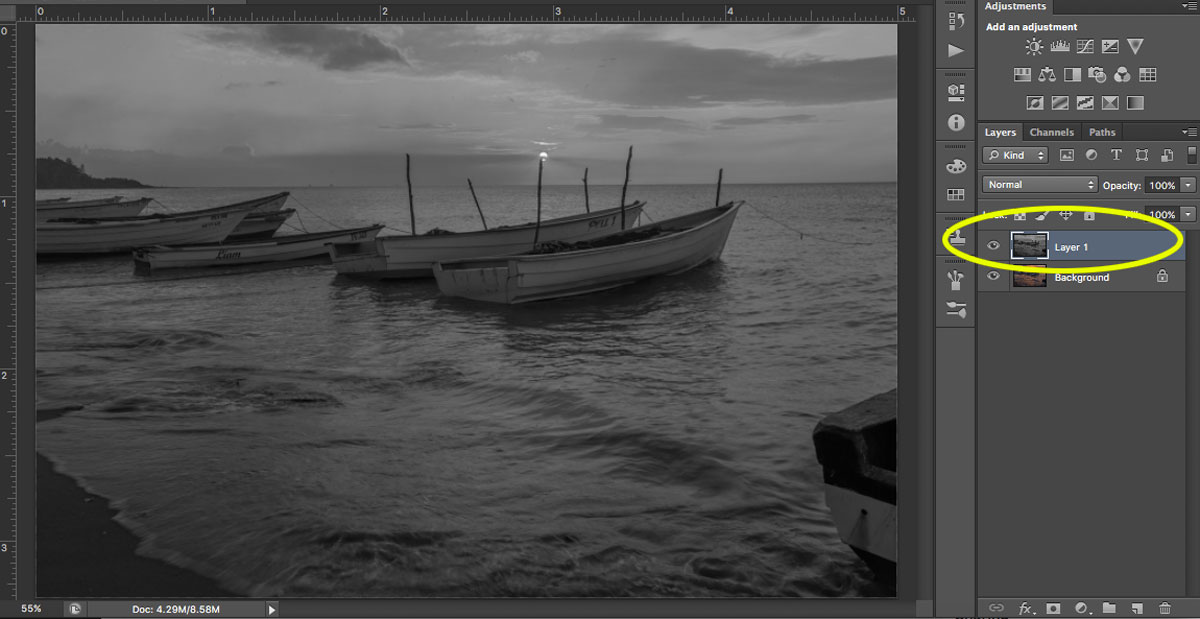
Step 2: Duplicate your layer.
Step 3: Desaturate your new layer (from Menu, Image > Adjustments > Desaturate).
sharpening your images
Step 4: Change your blend mode to Overlay. (Alternatively, you can use the Soft Light blend mode for a more subtle effect.)
Step 5: Now apply a High-Pass filter (from Menu, Filter > Other > High Pass) and choose a radius around 2.0 for an image of 730 pixels (on the long side). The Overlay option you chose above allows you to see how the radius affects the image so you can play around with it.
Note: The bigger your image, the larger your radius will be.
If the sharpness doesn’t look good on the entire image, you can use a layer mask and paint black over the areas where you want to hide the effect.
Step 6: Save for the web (from Menu, File > Save for Web). Check the Convert to sRGB box if unchecked.

If you’ve just begun your photography journey or if you’re looking to improve your basic editing skills, then these post-processing tips are a great place to start.
In fact, basic editing is often all you need to dramatically improve your photos.
So follow these tips, and watch as your images improve!

Share this article.

Thoughts and a Field Test: The Tamron 17-28mm f/2.8 Lens for Sony

Sony lenses are notoriously expensive, so it’s a welcome relief that third-party manufacturers have been making solid E-Mount lenses. The Tamron 17-28mm f/2.8 is one such lens. It is the highly anticipated follow-up to the Tamron 28-75mm f/2.8, which was announced in 2018 and is almost always on backorder due to its popularity. After testing the Tamron 17-28mm f/2.8, I have no doubt that this lens will be equally popular.
Read on to find out why.
Tamron 17-28mm for Sony E-Mount

The Tamron 17-28mm f/2.8 tech specs

First off, 17-28mm is indeed a niche and unique focal length. No other manufacturer makes a lens with this range. The closest comparison is the 16-35mm f/2.8, a focal length made by Sony, Canon, and Nikon.
If you’re disappointed about having less reach with the Tamron, consider that if you use this lens with a Sony full-frame, you can always shoot in APS-C mode, which gives you more range. This is one of the most useful features on my Sony a7R III.
Why Tamron went for this slightly more limited focal length is puzzling, but it likely explains how they kept the lens to such a small size. In the comparison photo below, you’ll see that the 17-28mm is essentially the same size as the original Canon 16-35mm f/2.8 and the Sony 24-70mm f/4. Weight-wise, the Tamron is the lightest, coming in at 420 g (0.93 lbs). That is quite a bit lighter than Sony’s own 16-35mm f/2.8, which weighs a whopping 680 g (1.5 lbs).
Since we’re on the subject of comparisons, let’s talk price. Sony charges $2,200 USD for their 16-35mm f/2.8 lens. While their lens offers more solid construction and a more flexible focal range, this is still a chunk of change. On the other hand, the Tamron 17-28mm is priced at $899 USD, which is quite reasonable for an f/2.8 lens.
Tamron 17-28mm for Sony E-Mount
Size comparison of the Canon 16-35mm f/2.8 (left), the Tamron 17-28mm f/2.8 (center), and
the Sony 24-70mm f/4 (right).

Image stabilization

The Tamron 17-28mm lens does not have optical image stabilization (OIS). However, it’s so lightweight that it’s still pretty easy to shoot stable photos and videos handheld. In fact, its size goes well with the Sony a7R III and the Sony a7 III.

Autofocus

The Tamron 17-28mm f/2.8 is equipped with a smooth and quiet autofocus (AF) system. It pairs well with modern Sony mirrorless cameras, and all AF modes are available, including Eye AF. In practice, I found Eye AF to be a bit sluggish and hit or miss. But then again, I don’t consider 17-28mm to be my ideal focal range for portraits anyway, and I would rather reach for a midrange zoom or a standard 50mm lens.

Best uses for the Tamron 17-28mm f/2.8

A wide-angle lens like the 17-28mm is ideal for capturing landscapes, interiors, and real estate. Those are the types of photography I focused on while testing this lens. The portraiture I did was minimal, and it was mainly for the purpose of shooting at an aperture other than f/11 to see how the bokeh performed (it did very well).
doors off helicopter view of city
A handheld shot taken from a doors-off helicopter ride.

Image quality

For my first test shooting with the 17-28mm, I took it on a doors-off helicopter ride. If you’ve ever been on one of these, you know how incredibly windy it can be in the main cabin and how difficult it is to get any shots in focus. This is very much a “spray and pray” kind of photography scenario. To my surprise, the 17-28mm did incredibly well.
From the moment I started shooting with the Tamron 17-28mm, I almost immediately forgot it was a third-party lens. Autofocus was snappy (I wasn’t using Eye AF), there was zero lag or miscommunication between the lens and the camera, and the image quality was stunning. Photos were tack sharp, there was no distortion, and the colors even seemed to pop a little more than usual.
view of shopping people

Physical construction

Since this lens is so compact and lightweight, don’t expect all-metal or polycarbonate materials like Sony uses in their GM lenses. However, the build quality of the Tamron 17-28mm still feels very solid in the hands, and I think it would hold up well over time.
Tamron says the 17-28mm is equipped with “moisture-resistant construction” and a hydrophobic fluorine coating to repel dirt and fingerprints. Not much else is said about weather sealing, and I wouldn’t feel comfortable subjecting this lens to extreme weather conditions.
long staircase and escalator

6-year Tamron warranty

One of the biggest benefits of buying a Tamron lens is their generous 6-year warranty. Effective for six years from the date of purchase (in the USA only), Tamron lenses are “warranted against defective materials or workmanship.” Meanwhile, Sony provides 1 year of warranty on their lenses.

A match made in photographer heaven

Based purely on specs, this lens pairs beautifully with the Tamron 28-75mm f/2.8. In fact, Tamron claims the combined weight of both of those lenses equates to less than 1 kg (2.2 lbs), which is incredibly light for two f/2.8 lenses. Both lenses also take the same filter size of 67mm, making it easy to swap polarizers and ND filters. This feature alone makes it very compelling to invest in both lenses.
photo of a barbershop

During the reigning days of DSLRs, many photographers scoffed at third-party lenses, saying that “you get what you pay for.” Perhaps back then they had a point.
But today, third-party lenses have really stepped up their game, and the Tamron 17-28mm f/2.8 is one of the best examples of superior third-party glass. If you’re in the market for a wide-angle lens for your Sony body, you can’t go wrong with this lens.

Share this article.

Tamron 17-28mm f2.8 Lens with Sony A7R III - First Impressions + Video Test

Friday, September 13, 2019


Free Street Photography Ebook.  Just copy and past the link into your browser, hit ENTER, & enjoy.


 cover of fear of street photography ebook


http://www.erickimphotography.com/Downloads/Books/31-Days/31%20Days%20to%20Overcome%20Your%20Fear%20of%20Shooting%20Street%20Photography.pdf

 (P.S.  After conquering the 31 day challenge above, try this one to become an even better Photographer.)
    https://resources.digital-photography-school.com/ref/937/