Tuesday, March 5, 2019

These Quick and Easy Photography Tips Will Take Your Photos Up a Notch


Quick and Easy Photography Tips image photo by hsyncoban via iStock
Photography is hard work, there’s no mistake about that.
But there are plenty of tips, tricks, and techniques you can learn that will help you take better photos right now, today. 
That’s where this list comes in…
Below, I’ve outlined just a few quick and easy photography tips that will help you take your photos to the next level.

Editor’s Tip: You need the right gear to advance your photography skills. START UPGRADING YOUR KIT TODAY WITH A NEW CAMERA STRAP.

Easy Photography Tip #1: Fill the Frame

Quick and Easy Photography Tip 1 image
 photo by opolja via iStock
A common problem in photos taken by new photographers is that the subject isn’t strong. Without a commanding presence in the picture, it can be a bit on the boring side, leaving viewers wondering what the subject of the photo might be.
You can resolve all those problems by filling the frame with the subject.
Use your lens’s zoom (or simply walk closer to the subject if you don’t have a zoom lens) and frame the shot such that the subject is the most prominent thing in the photo.
beginner photography tips image
 photo by eugenesergeev via iStock
As you can see in the sample photos above, this trick works with everything from portraits to architecture.
Give it a try, and see how much more impactful your photos can be!

Learn More:

Easy Photography Tip #2: Keep Your Eyes on the Prize

Quick and Easy Photography Tip 2 image
 photo by silverblack via iStock
When you watch people take photos, you’ll often see them close the eye that isn’t looking through the viewfinder. You might even do this yourself.
If you do, keep that other eye open. It has a couple of advantages.
First, by having both eyes open, you can see through the viewfinder and also see what’s happening out of frame. This is especially important when you’re photographing scenes that change, like a sporting event or a wildlife shot.
photography tricks for beginners image
photo by lechatnoir via iStock 
Secondly, if you’re shooting portraits, keeping the off-camera eye open allows you to connect with the subject because they can see the whites of your eye. That’s advantageous because it can help the subject relax in front of the camera, and the more relaxed they are, the better the portrait will be.

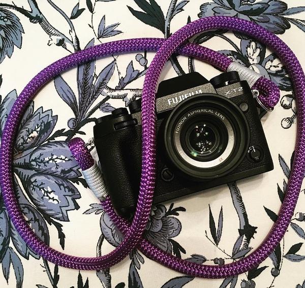
Easy Photography Tip #3: Gear Up With a Better Camera Strap 

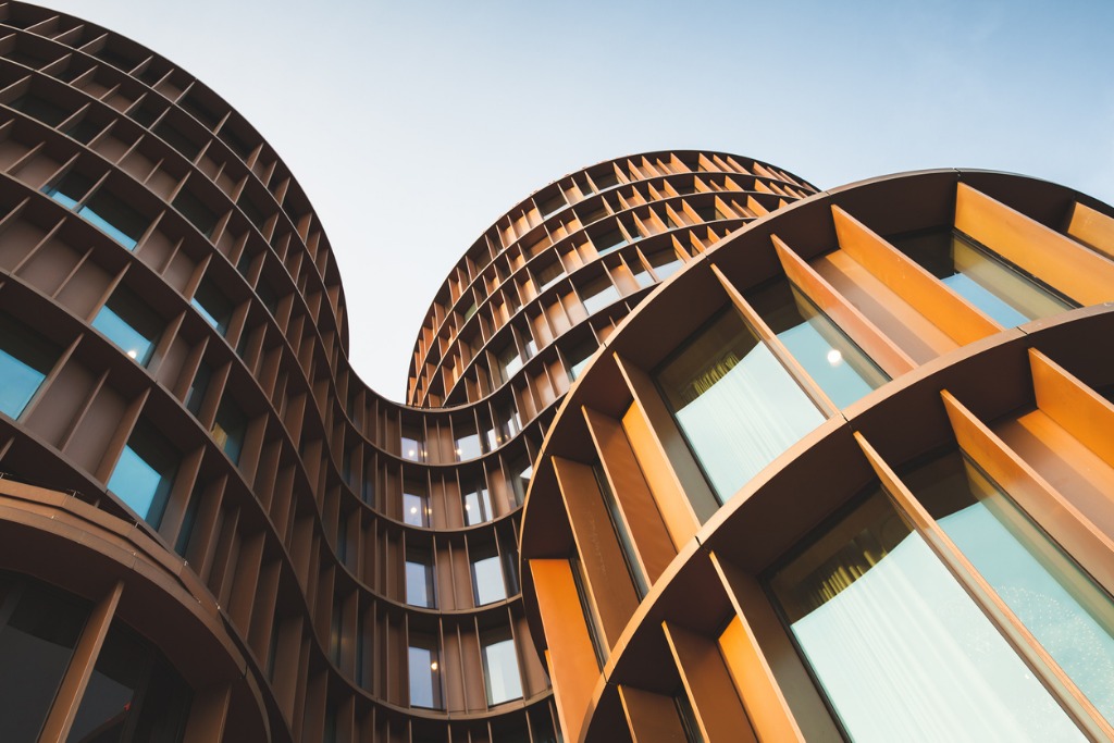
hyperion 1 image
I know what you’re thinking…
How can a different camera strap improve your photos?
Think of it this way - the strap that came with your camera is totally uncomfortable, right? It cuts into your shoulder and causes your neck, shoulders, and upper back to ache. The more you hurt, the less likely you are to keep shooting, let alone enjoy it. 
And since practice makes perfect in photography, being comfortable while you take photos will enable you to shoot more often and take more photos, thereby becoming a better photographer.
You don’t have to spend a ton of money to get a better camera strap, either.
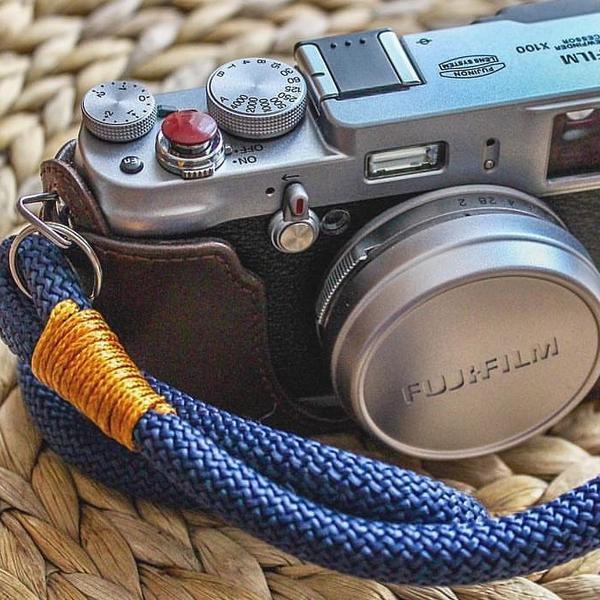
hyperion 2 image
In fact, I field tested a Hyperion camera strap - which set me back less than $20 - and it totally rocked.
The unique construction of the strap, which uses acrylic cloth cordage, was both attractive looking and comfortable to wear. 
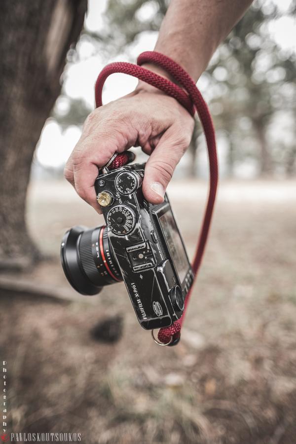
hyperion 3 image
The cordage is nice and thick, so it helped distribute the weight of my Nikon D850 over a larger area.
I also liked the fact that if I didn’t want to carry the camera over my shoulder that I could use it as a sling strap or wrap it around my wrist.
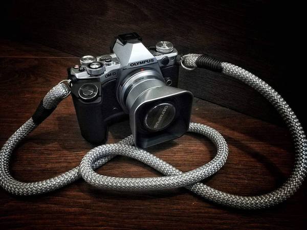
hyperion 4 image
The point here is that straps like these look great, are incredibly versatile, and comfortable to boot, so it’s really the best of all worlds, especially at this price point!

Courtesy of:  PhotographyTalk

Avoid These 4 Post-Processing Mistakes That Can Ruin Your Images


Post-processing is a particularly sensitive topic and there’s always a certain amount of processing versus non-processing discussions that take place after articles on the topic. It’s not hard to understand since how you choose to process your images is your artistic choice.
There’s not necessarily a right or wrong way to go about it but, that being said, there are certain “mistakes” that I notice quite regularly, especially amongst beginning photographers who aren’t quite able to achieve the looks they want.
Avoid These 4 Post-Processing Mistakes That Can Ruin Your Images - mountain scene
#Color#Mistakes#Photographers

Some of these mistakes are obvious while others, not so much. What they have in common, though, is that they are mistakes that most of us are guilty of making or have made at some point. Let’s dive in.

1. Not Considering Color

Let’s start with a mistake that the majority of us are or have been making, and one which isn’t necessarily that obvious to all of us: failing to understand color harmonies.
Color harmonies might be easier to control as portrait or studio photographers but as landscape photographers, we have to work with the conditions nature gives us. Sometimes, our job is to find order in the chaos and highlight the most interesting aspects of the landscape. Indeed, it’s not an easy task.
Avoid These 4 Post-Processing Mistakes That Can Ruin Your Images - men in red jacket walking on a hill
The discussions can quickly become controversial as we start talking about working with colors in nature. I’m not here to say what you should or shouldn’t do but I’ll give you a couple of ideas on how you can work with color in post-processing:
  1. Use the HSL sliders in Lightroom/Camera RAW to adjust the hues of certain colors to create a better color harmony in the image.
  2. Rhe HSL sliders can also be used to desaturate colors that are too dominant and take unnecessary attention away from the main subject.
  3. Use techniques such as Luminosity Masks or Saturation Masks in Photoshop to selectively work on the brightness, saturation and contrast of specific areas within an image.
The goal when working with colors should be to only highlight those that are in harmony with each other. I often bring out a color wheel to check that the colors in an image are in harmony and if I need to desaturate (or saturate) any of them.
Avoid These 4 Post-Processing Mistakes That Can Ruin Your Images - rocky mountain scene

2. Only Making Global Adjustments

This brings us to mistake number two: you only make global adjustments. In other words, each adjustment you make is applied to the entire image.
Let’s say that you want to increase the green grass in one of your summer images. The traditional way of boosting the color is by using the Saturation slider. However, that will increase the saturation of the entire image and will in most cases lead to an oversaturated image; which results in visual chaos rather than a pleasant experience when viewing it.
In mistake number one, I briefly mentioned using the HSL sliders for making adjustments. By using this panel you’re able to affect only one specific color rather than the entire image. By using the Green Saturation slider you can target only the green colors and make an adjustment to only those hues.
Avoid These 4 Post-Processing Mistakes That Can Ruin Your Images - lighthouse and green field or hill
It’s not only when adjusting the saturation that you should work selectively though. Personally, I make selective adjustments (often through Luminosity Masks in Photoshop) when working with color, contrast, brightness and pretty much any other adjustment you can think of.

3. Clarity at 100%

You might not want to hear this but increasing Lightroom’s Clarity slider to 100% is rarely a good idea, especially when it’s added globally. While I agree that adding clarity can often give an extra pop to the image as it brings out a lot of nice textures and details, it does more harm than good when it’s applied to the whole image. It also adds a significant amount of noise and lowers the overall quality of the file.
Let’s look at an example. In the image below I have increased the clarity to 100%. (Besides that, no other adjustments were made). I do like how it brought out a lot of texture in the mountain but the foreground now contains just as much texture and it’s competing with the mountain to grab your attention. In fact, the moss in the foreground is the natural place to look as it’s both bright and crisp.

If instead, I only add clarity to the mountain by using a Gradient Filter you’ll see that it makes a big difference compared to the image above. There’s still nice texture in the mountain but the foreground is now less crisp and working as a natural leading line.
Note: I prefer to rather use a mask in Photoshop and add it to only the mountain, as a gradient filter adds it to more places than what I want. But you can now use the brush tools to edit your gradient filter in LR as well.
Avoid These 4 Post-Processing Mistakes That Can Ruin Your Images
Clarity applied only to the mountain.
Keep in mind that you want the most important areas of the image to be the sharpest. Naturally, the viewer’s eyes are guided to the sharpest parts of the image. Also, there’s no point in adding clarity to soft surfaces such as a blue sky or silky water. These are often better left alone.

4. Leaving Dust Spots

Unless you’ve got a brand new camera or you’re a superstar when it comes to having clean equipment, it’s likely that you’re going to have at least a few dust spots on your images. This is especially true if you regularly photograph in rough conditions including wind, snow, rain, and sand.
Removing dust spots is super easy and takes no more than a few minutes, so really there is no excuse not to do so. You have to admit, it looks quite unprofessional if a beautiful image has a bunch of dust spots in the sky. Would you hang that on your wall?
Keep in mind that if you enlarge and print your images, even the smallest dust spots become visible. Therefore, it’s a good practice to zoom in 100% on the image to look for any possible dust spots. When you find one, simply use Lightroom’s Spot Removal Tool and move on to the next.
It can be tedious work if you’ve got an extremely dirt lens but it’s something that needs to be done.
Avoid These 4 Post-Processing Mistakes That Can Ruin Your Images
Turn on “Visualize spots” to help you find dust.

Conclusion

To end this I want to say one final thing: the most important is that you’re happy with the images you capture and process. If you like highly saturated images, go for it. If you like tilted horizons, good for you.
Stay true to your style and vision and create the art you want – don’t let anyone decide what your images should look like.
Avoid These 4 Post-Processing Mistakes That Can Ruin Your Images

Share this article.

Monday, March 4, 2019

3 Quick Tips for Achieving Moody Portraits with Natural Light

If, like me, you are drawn to moody portraits and have been wondering how to take them, read on. Achieving moody portraits with natural light can be quite simple. I hope this takes the mystery our of dark moody portraits in natural light.
3-tips-moody-natural-portraits-dps-lily-sawyer-photo
#Photographyforever#Portraits#Naturallight

Before you start, plan your photo shoot first by keeping the following in mind: mood, tones (light or dark), outfits (colors to complement the tones), and the time of day to shoot. This may not make a difference to you, but to me, with my window north-east facing, I know I get decent light between 10am and 2pm, and after that, light availability deteriorates. This is the limitation of shooting with natural light. You are dependent on the amount and quality of the available light.

1. The importance of background

The easiest way to achieve a natural light moody portrait is by using a medium to dark background. The darkness of the background adds depth and the illusion of space and getting drawn into it. In effect, it also gives the illusion of a three-dimensional space. Not only that, but it also helps provide contrast between the background and the face of the subject which you want to emphasize and focus on. You draw the viewer’s eye to the image, and the background effectively provides context and setting.
There are various types of backgrounds: plain solid color, textured, scenery, and patterns such as wallpaper. Choose one that doesn’t clash with your subject (unless clashing is your intention) so that the portrait subject is the star of the show and the background is just that – background.
With a plain background, you can always add texture in post-production and change the tones up if you wish. Below is a side-by-side comparison of the photo without texture (left) and with a warm texture added (right).
3-tips-moody-natural-portraits-dps-lily-sawyer-photo

2. The importance of lighting

Because we are limiting ourselves to available natural light, it is a good idea to work with it. In most spaces, especially in homes, natural light comes from a 45-degree angle streaming from a window unless you have skylights in which case light comes from the top. You would want to cover that skylight and limit yourself to one light source coming from one direction, preferably 45-degree angle from the side. You want to place your subject in such a spot where the light hits them at this angle. Beware of placing the subject too close to the window as this tends to illuminate the face too much.
You want just a small amount of light touching the subject to achieve that ambiance and mood you are after. Before you shoot, look at the shadows on the face and especially under the nose. Position your subject by moving them around adjusting to the light and how the shadows fall on the face.
From a 45-degree angle window lighting where the window is higher than the subject, shadows on the face get cast at a slightly downward angle to the side opposite the light source. This is felt to be a pleasing shadow and is also known as the Rembrandt lighting. I have written an article touching on this with both natural and artificial lights on here.
With Rembrandt lighting, you need a reflector positioned on the opposite side of the light. The aim is to reflect some of the window light back onto the subject’s face, so you get a softer gradation of shadows instead of a very sharp drop from light to dark. If you don’t have a reflector, you can use a white sheet or white piece of cardboard.
Reflectors come in different colors which cast a tint on the face so choose carefully. See here for a side-by-side comparison of what different types of reflectors do.

3. The importance of light diffusion

Diffusion is passing the light source through a translucent material so that the light is spread out instead of coming from a concentrated source. Once spread, it touches the subject more softly thus removing the harshness of otherwise undiffused light.
One can argue that, on a cloudy day, available natural light coming from a window is already diffused by the great big clouds above. I agree with this. However, if you have the option to diffuse, I would still do it. On a sunny day where the light is powerful, I would say diffusion is an absolute must.
In the photo above, the window light is frosted at the bottom and covered in a voile fabric at the top thereby acting as a diffuser. From my experience of shooting for more than a decade, I have learned to see the difference between undiffused and diffused light and the former is definitely softer and better for the skin.
Overall, it’s a factor that contributes to achieving the type of moody portrait I am aiming for in this shoot.
I hope you found this helpful!

Share this article.

Gear Review – Fikaz Sony E-Mount Lens Adapters

Not too many years ago, in a sad and dark time, there weren’t many ways for us adventurous types to branch out in ways we used our photography gear. Namely, our camera lenses weren’t easily usable across platforms. It was possible, but adapters and converters weren’t plentiful or easy to find.
1 - Gear Review - Fikaz Sony E-Mount Lens Adapters
#Nikon#Sensor#Adapter#Photographyforever

Today, mirrorless, full-frame, and crop-sensor cameras are essentially pairable with many lenses. Adapters for these lenses are relatively easy to find too. So much so, that there is an over-saturation of the lens conversion market making most lens mount adapters affordable for any budget.
Unfortunately, not all lens adapters are created equal. So when Fikaz, a company I had never heard of, approached me to test out some of their new Sony E-Mount (NEX) adapters, I was open-minded but still cautious of yet another lens adapter-maker.
Luckily, all of my reservations about the Fikaz Sony E-Mount lens adapters were unfounded. As it turns out, the two adapters I received were pleasantly high-quality pieces of kit. Let me explain to you what I thought about these nifty little adapters from one of the newest kids on the lens converter block.
As I said, the lens adapter world is a hot commodity right now and being able to use your lenses (especially manual vintage lenses) is currently in vogue. The two adapters I evaluated were the Nikon F (G) to Sony E-Mount and M42 to Sony E-Mount. Both adapters were high quality in both aesthetics and their build.

Nikon F (G) Adapter

Until their recent leap into the full-frame mirrorless realm, and since the late 1950s, all of Nikon’s lens mounts have been variations of the “F” mount. So technically, virtually all Nikon lenses should be compatible with a Nikon F-mount adapter.
The caveat is that later “G” series lenses (read as modern) don’t sport a physical aperture ring on the lens itself. This missing aperture ring means that while the lens is physically shootable with most F-mount lens adapters, there is nowhere for the photographer to change the aperture. A dedicated G-mount adapter comes in handy because the shooter can use the aperture ring on the adapter to physically control the amount of light entering the camera via the lens.
2 - Gear Review - Fikaz Sony E-Mount Lens Adapters
The Nikon F (G) adapter is solidly built and feels extremely substantial in the hand. The aperture controller ring is a nicely contrasting silver against the black frame of the adapter.
3 - Gear Review - Fikaz Sony E-Mount Lens Adapters
4 - Gear Review - Fikaz Sony E-Mount Lens Adapters
The Nikon F (G) adapter was tested using my relatively ancient Nikkor 70-300mm F/4-5.6 lens. Both the lens and camera sides of the adapter fit extremely snug…but not too snug…to the lens bayonet and the camera mount. Absolutely no play or movement was observed.
5 - Gear Review - Fikaz Sony E-Mount Lens Adapters
A well placed and crisply-springy release slider is also present on the adapter which is, again, in the visually pleasing contrasting silver tone. Fikaz has also included a highly visible red bead for easy mating of both the lens and camera with the adapter.
6 - Gear Review - Fikaz Sony E-Mount Lens Adapters
From what I would approximate, the aperture ring, or rather more accurately, the “aperture approximator” ring works in full stop increments with six stops of adjustment. Basing my lens at 70mm and F/4, the apertures provided from the adapter should be approximately F/4, F/5.6, F/8, and so on. The adapter has a visual representation to aid you in selecting aperture size.
7 - Gear Review - Fikaz Sony E-Mount Lens Adapters

8 - Gear Review - Fikaz Sony E-Mount Lens Adapters
Aperture control using the Fikaz Nikon F (G) to Sony E-mount adapter
9 - Gear Review - Fikaz Sony E-Mount Lens Adapters
Aperture control using the Fikaz Nikon F (G) to Sony E-mount adapter

M42 Adapter

I had intended to test the Fikaz M42 to Sony E-mount adapter using a fan-favorite lens, the Helios 44-2. Unfortunately, I realized far too late that my Helios was not in my bag. Seeing as I’m currently 3,000 miles from my test lens, this portion of the review shows my impressions of the build and appearance of the M42 adapter only. Which I must say, is extremely impressive for its price tag.
10 - Gear Review - Fikaz Sony E-Mount Lens Adapters
The M42 adapter from Fikaz is incredibly Spartan in its appearance. The majority of the converter is mostly flat black with accenting bare aluminum areas which cut an understated yet classical form. Like the Nikon adapter, the markings are well executed and quite clean. The threads on the M42 side are very uniform and smooth with no burrs or metal shavings present.
11 - Gear Review - Fikaz Sony E-Mount Lens Adapters
This same level of craftsmanship also holds through for the Sony bayonet end of the adapter which shows no flaws in the cutting or finish of the mount. The perimeter of the M42 adapter sports deep cut serrations offering a superb grip even with gloved hands.
12 - Gear Review - Fikaz Sony E-Mount Lens Adapters

Final Thoughts on the Fikaz Sony E-mount Adapters for Nikon F(G) and M42

In the grand scope of things, both the construction quality and thoughtfulness of design displayed with Fikaz’s first entries into the world of mirrorless adapters impressed me. Hopefully, both the build and looks of the adapters hint at great things to come too.
The Nikon F (G) adapter worked extremely well to allow a large measure of aperture control with newer Nikon lenses and mated perfectly to my 70-300mm test lens. However, I wasn’t able to test the M42 mount with a lens, the build and precision left little doubt that it would also perform well.
That said, there are some things to keep in mind about the M42 (and any other non-AF adapters). Essentially, all that is needed is a mount conversion. There is no real need for the relatively large size of the adapter which can affect infinity focus. While the M42 adapter has an excellent build, it may be beneficial to search for a slimmer “ring” adapter if you are worried about focusing issues.
On that note, the Fikaz adapters both feature black paint on their interior but no flocking to eliminate possible reflections. This shouldn’t be a problem, but maybe a concern for those seeking complete security for lengthy exposures.
Currently, the Fikaz Sony E-mount adapters are available for the following lens mounts: Nikon F (G), M42, Pentax K, and Fuji X mount. I have been informed that Canon EF mount will be available in the future. At the time this review, these adapters have a selling price of around US$24, making them a bargain. There are plenty of choices for lens adapters and converters today. Some are high quality and others, well, not so much.
I feel as if Fikaz can now join the ranks of some of the better budget adapters currently on the market. A bonus for those who are looking at a cost-effective way to use their lenses across a wide range of camera systems.

Share this article.

Sunday, March 3, 2019

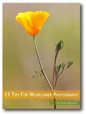
Free eBook on Wildflower Photography

With spring beginning here in the southwestern United States, I thought it was time to update our free ebook on wildflower photography. The original version was released about three years ago, so it was due for an update.
Most of the content is the same, but I’ve learned a lot in the last three years, so I’ve updated just about every page in the book, and replaced a few tips with newer articles.
Anyway, here’s a sneak peak of what you’ll learn in this ebook:
  • How to get perfect light
  • How to control the light
  • How to get sharper images
  • How to get a perfect exposure
  • How to get a perfect background
  • How to focus closer
  • How to make identification easier
  • How to battle the wind
  • How to create intimate images
  • How to leave no trace
  • How to sharpen your photos in Photoshop
  • How to darken the background in Photoshop
  • How to fix underexposed areas in Photoshop
So, what are you waiting for?

The eBook is in Adobe PDF format (which you can view with Adobe’s free reader).
If you enjoy the tips in this eBook, the best way to thank us is to tell your friends about it, or purchase our complete guide to photographing wildflowers 🙂
To celebrate the spring season, I’ve also decided to permanently reduce the price of my complete guide to wildflower photography. You can get the ebook now for just $12.00!

Share this article.

How to Shoot and Process Better Waterfall Photos

Everybody loves a good waterfall image with a long exposure, but in this article, I’ll show you how to capture more detail and motion in that fascinating tumble of whitewater. Water is the most powerful force of nature on our planet and there’s a simple technique you can use when photographing waterfalls that more effectively harnesses the fury and chaos of mother nature.

Tip 1 – Use a faster shutter speed

How to Shoot Better Waterfall Images - Comparison
#Photographyforever#ZeissBatis#Shutterspeed

While many photographers would consider 1/3″ (one-third of a second) a slow shutter speed, it’s typically a lot faster than many would use for shooting waterfalls. I’ll sometimes even use 1/6″ (like in the left image above) depending on the volume of water in my composition.
Shooting waterfalls using a 1/6″ to 1/3″ shutter speed captures far more detail and texture in the moving water. It’s still long enough to create motion blur but fast enough to capture the motion of individual water droplets as they blast through your scene.
I feel that these faster shutter speeds tell the story much better than a totally silky smooth white out because the added detail shows the true power of water as it carves through the landscape.

Tip 2 – Use a wider (faster) aperture if required

As a landscape photographer, I usually prefer to stop down to apertures like f/11 or even f/16 so that I can capture the maximum depth of field and sharpness. This is the ideal scenario if you’ve got enough light to work with, but what if there isn’t much available light and using faster shutter speeds just ends up giving you an image that’s way too dark?
There are two things you can do to deal with this problem. Firstly, I’ll open up the aperture to let more light into the camera. For the above images, I was shooting with the Zeiss Batis 18mm and was able to open up to f/2.8. This often gets me closer to the 1/6″ shutter speed while capturing an image that is still bright enough, even in low light conditions.

Tip 3 – Increase ISO as a last resort

Increase ISO as a last resort - waterfall tips
When it starts to get dark I can increase my ISO which makes my sensor much more sensitive to light and enables me to get away with faster shutter speeds in low light situations. Bumping up the ISO is the last resort as it introduces noise and degrades image quality drastically.

Tip 4 – Shoot an overexposed frame at f/11 with a low ISO

Overexposed waterfall photography
This overexposed shot captures bright shadow detail in the mossy rocks. I don’t care about the blown
out white water. I’ll be erasing that later in processing.
My first three steps explain how I capture all of that lovely motion and detail by using faster shutter speeds. But I’ll also capture a super bright image with maximum depth of field at low ISO which I can use for the rest of the scene. This gives me great image quality for everything in the frame that doesn’t include white water.
I usually stop down my aperture to around f/11 (I used f/8 because my lens performs well at that aperture.) Then I watch my Live View display while increasing the shutter speed and overexposing the image until I can clearly see all of the shadow detail on my display. For this to work, I must have Exposure Simulation enabled on my camera (check the settings for yours).
When you try this you may find that the water is a completely blown out mass of pure white. That’s okay because you’ll be using the water from your darker, faster exposures when you blend these images together.
All we care about with this shot is capturing an image that clearly shows the surrounding area. In my shot, it’s the mossy rocks and cliffs around the waterfall that are the priority.

Putting it all together

There are a few options for blending multiple exposure images like this:
  1. HDR – Fastest, easiest but less realistic and not the best image quality.
  2. Luminosity Masks in Photoshop – Steeper learning curve but often results in the best image quality. Read more on that topic here.
  3. Manual Blending in Photoshop – Easier than learning Luminosity Masks and almost the same image quality.
Photoshop users have more options here and I’m going to assume that if you already know how to use Luminosity Masks you probably don’t need me to show you how to blend these exposures. With that in mind, I’m going to show you an easy way to blend these exposures very simply in Photoshop. Lightroom users might prefer to use the built-in HDR tool of Lightroom to blend exposures.

Waterfall Image Processing

Shooting an Over Exposed Waterfall Image for Shadow Detail
First of all, let’s look at the RAW files and talk about the camera settings I decided to use. This first exposure was shot with an aperture of f/8 for great depth of field and sharpness. I used a long exposure time of 13″ so this is obviously the overexposed frame I talked about earlier.
My next frame was shot at 2.5″ which was the shutter speed recommended by my camera’s light meter. Even though the light meter was telling me that 2.5″ was ideal, it’s still not fast enough for me to capture water detail because as you can see below, the water is just a mushy white blur. So I decided to shoot a couple faster frames even though I knew they’d be underexposed.
How to Shoot Better Waterfalls - Still too long of an exposure
ISO 50, f/8, 2.5 seconds. The exposure was still too long to capture detail.
The next frame was shot at 1/4″ which I achieved by opening the aperture to f/2.8. I would have much preferred to have stayed at f/8, but it was getting dark and I needed as much light as I could get. Even though it’s clearly underexposed and quite dark you can see it captured much more detail in the water.
Finally, for the next frame, I went for an even faster shutter speed of 1/6″ and this is the one I’ll use to blend with the first overexposed frame.
The ideal amount of motion blur for waterfall photography
1/6th of a second was the magic number to get detail in the water.

Step 1 – Process the overexposed image

Even though the water in this image is completely smoothed out, all I really want from here is everything BUT the water. I might choose to keep a few parts of the silky water movement but for the thicker sections of water, I’ll be getting rid of that mushy white stuff.
Processing Overexposed Waterfall Image in ACR
I’ll open this in Adobe Camera RAW and bring down the exposure slightly, brighten shadows by +18 and then brighten the blacks to +8. I’ll also punch the color vibrancy up to +8 and then hit Open Image to bring it into Photoshop.

Step 2 – Process the underexposed image

Processing of Underexposed Waterfall Image
The first thing I need to do here is to increase the exposure to +1.50. This brightens the image up but also kills some of the detail in the brighter sections of the white water. I’ll fix that by pulling the highlights down to -27 and the whites down to -17 then hit Open Image to bring it into Photoshop.

Step 3 – Stack and align the layers

I can easily stack the overexposed image on top of the darker one by clicking in the layers panel and simply dragging it to the tab for the underexposed image. Photoshop will drop a copy of that layer on top of the original.
Align the layers just in case there was any camera movement between shots by making sure both layers are unlocked. Hold down shift and click on each layer so that both layers are selected. Then go to Edit > Auto-Align Layers. I go with the default Auto and hit OK. In this case, nothing happened because there was no misalignment.

Step 4 – Selectively erase the overexposed water

The Photoshop Eraser Tool
This is the fun part where a bit of skill and judgment comes in handy. With practice, you’ll get better at choosing which parts to erase on your own waterfall images. My goal here is to get rid of any boring bits of overly silky water to reveal the more interesting motion blur of the layer underneath. Take your time and use a bigger brush than you think you might need. If you use a brush that’s too small you’ll be able to see the halo edges of your brushwork.
You don’t have to erase ALL of the white water, just the parts you find lacking in action and drama. Some areas may look better from the overexposed shot and others may look better from the underexposed shot. Finding the perfect balance is down to your artistic judgment.
Try switching the top layer on and off by clicking the eye icon next to the layer. This helps you to see if the changes you’ve made work towards creating a better image.
You can also change the opacity of the eraser brush so that the effect is less intense. For the top part of the falls, I’ll use an opacity of 50% so the effect is more subtle. If you prefer non-destructive editing and are already familiar with Layer Masks you could perform the exact same process. I just prefer the fast simplicity of this method and wanted to show you the easiest way to get a quick and effective result.

Step 5 – Fine-tuning the blending

To make the two layers blend more seamlessly I’m going to make the overexposed layer slightly darker. I choose Image> Adjustments > Brightness/Contrast and set the brightness to about -38. I can also brighten up the darker exposure slightly so that it gets closer to the brightness of the overexposed layer by going to Image > Adjustments > Shadows/Highlights and setting the Shadow Amount to 3%.
Shadows / Highlights - processing waterfall images
This result is a nice, flat looking image that has a great dynamic range with lots of texture, detail, and motion in the water. From this point, you can do whatever you like to the image, such as add contrast, play with colors, or dodge and burn – whatever it is you like to do with your nature images normally.
The benefit of using this method is that your water motion will be much more interesting and engaging to your viewers than just a silky smooth white out.

Final thoughts

How to Take Better Waterfall Photos
I just want to state that all of this is subjective. If you prefer waterfall photos that contain little to no detail in the motion of the water, good for you. By using the techniques I’ve outlined in this article you can get the best of both worlds and decide which combination of options works best for your image in post-production.
I hope this helps to improve your waterfall photography.

Share this article.